Beyond Color and Gloss: How Plastic Texture Tells Your Product's Story
By Max Calder | 19 November 2025 | 12 mins read
Table of contents
Table of Contents
The silent partnership of design is often forgotten the moment a person first touches a product. For many design projects, the material definition for a plastic part is dismissed with two simple inputs: a base color and a gloss percentage. You plug those numbers into the renderer, hit go, and expect a convincing result. But the moment you look at that flat, digitally perfect surface, you realize the visualization is fundamentally incomplete. This guide is for moving past that. This is the guide that shifts your perspective. We're going to move beyond the superficial and dive into the functional reality of engineered plastic textures. We'll explore how choices from a micro-fine matte finish to a complex molded grain are not aesthetic afterthoughts, but critical design pillars that govern everything from a user's subconscious perception of quality to the product’s actual durability and safety.

Why texture choices shape product reality
When you translate a product into a digital model, the texture becomes the bridge between concept and reality. It defines how light behaves, how a surface feels, and ultimately how believable your visualization becomes. Color and gloss can only get you so far; texture is the element that grounds your render in the physical world. Understanding why a surface is engineered a certain way allows you to replicate not just how a product looks, but how it behaves and that’s what transforms a render from simply accurate to truly authentic.
Moving beyond basic color and gloss in product visualization
When a project is tight on time, material definition can get boiled down to two things: color and a gloss value. You dial in the RGB, tweak the roughness slider, and call it a day. But we both know that’s not how products work in the real world. They’re held, touched, and exposed to the elements. The way a surface feels is just as important as how it looks, and that feeling is a direct result of its texture.
Sticking to a purely visual approach is a trap. It ignores the entire tactile dimension of a product. That subtle grain on a car’s dashboard isn’t just decorative, it’s an engineered surface designed to minimize glare. The soft-touch finish on your headphones doesn't just feel premium, it provides a secure grip. These choices are functional. In rendering, if we ignore the why behind the texture, our visualizations look flat and unconvincing. They lack the story that touch tells, a story about quality, durability, and intended use.
The psychological effects of material texture in design
Before a user even thinks about a product's features, they've already made a subconscious judgment based on its feel. Texture is a powerful, non-verbal communicator. A high-gloss, perfectly smooth surface might scream premium and high-tech, like the back of a new smartphone. But it also signals a need for care; it’s prone to fingerprints and scratches. It feels delicate.
On the other hand, a matte or rubberized texture communicates something entirely different. Think about the handle of a high-end power tool. Its textured, soft-touch grip doesn't just prevent slipping; it communicates ruggedness, safety, and control. This is the core of tactile design principles: linking feel to function. A product’s surface texture sets expectations:
- Grip and safety: Does this feel secure in my hand?
- Comfort and ergonomics: Can I hold this for a long time without discomfort?
- Cleanliness and maintenance: Will this surface hide smudges or be easy to wipe down?
- Perceived value: Does this feel cheap and hollow, or solid and well-made?
As a designer, your ability to translate these tactile cues into a digital model is what separates a good render from a photorealistic one. It’s about understanding the subtle story each surface tells and ensuring your visualization captures it perfectly.
A practical guide to plastic surface characteristics
Understanding how different plastic finishes behave is fundamental. It’s less about memorizing material presets and more about knowing why you’d choose one over another. This is the core of surface texture engineering.
Gloss vs. Matte: The fundamentals of light interaction
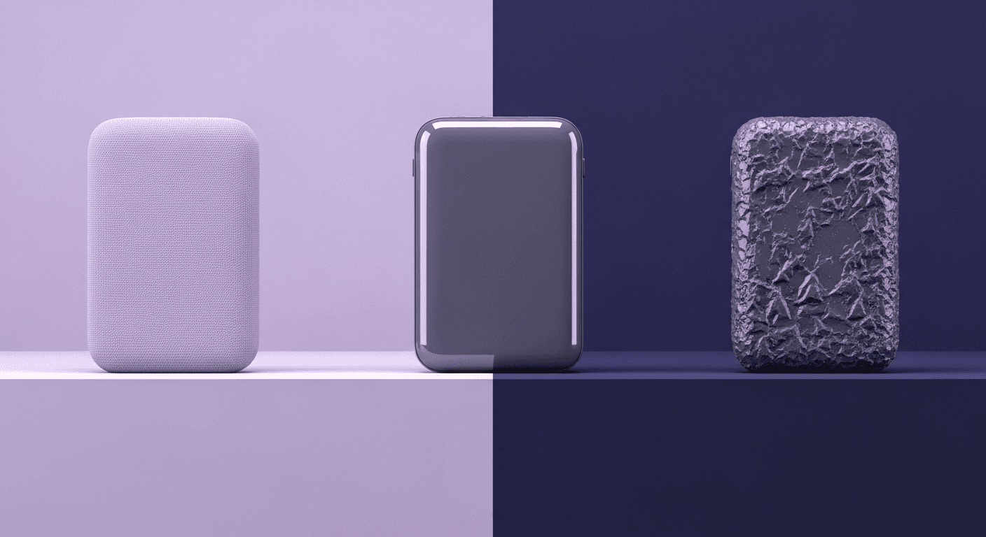
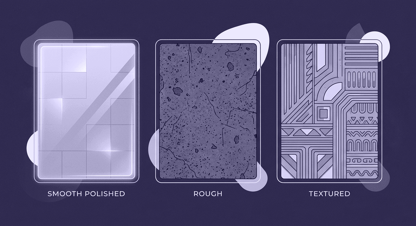
This is the classic matchup, and it all comes down to how a surface treats light. A high-gloss surface is like a mirror at a microscopic level. It’s incredibly smooth, so light reflects directly and uniformly. This creates sharp, clear reflections.
- High gloss: Often used in consumer electronics or automotive trim, a glossy finish communicates a sleek, premium quality. It makes colors appear richer and deeper. The downside? Every single fingerprint, smudge, and speck of dust becomes a spotlight. It’s also less forgiving of imperfections in the molding process, as any sink mark or flaw will be highlighted by those perfect reflections.
- Matte/Satin: A matte surface, in contrast, is microscopically rough. It scatters light in countless directions instead of reflecting it directly. This diffusion is what makes it non-reflective. A satin finish is the happy medium, a little bit of sheen without the mirror-like reflections. Matte finishes are brilliant for hiding imperfections, reducing glare, and conveying a sense of understated, modern quality. Think about the interior of a car, most of the large surfaces are matte to prevent distracting reflections while driving.
Grained & mold-tech textures: Engineering for reality
This is where plastic surface characteristics get really interesting. Grained textures are patterns embossed directly into the mold tool, creating a permanent texture on the plastic part. These aren't random; they are engineered for specific functional and aesthetic outcomes.
Common patterns include leather, wood, and geometric stipples (like the VDI 3400 standard you see in automotive). These textures do more than just mimic other materials. They are workhorses for product ergonomics and durability:
- Improved grip: A grained surface provides more friction than a smooth one, making products easier and safer to handle.
- Scratch resistance: The peaks and valleys of a texture make minor scuffs and scratches far less visible than on a flat, smooth surface.
- Hiding imperfections: Textures are fantastic at masking minor molding defects like flow lines or sink marks, leading to higher manufacturing yields.
- Aesthetic consistency: Using a standardized grain (like a Mold-Tech pattern) ensures that parts made from different tools or at different times have a consistent appearance.
Soft-touch & rubberized finishes: Designing for human interaction
When you want to take the human-centric feel of a product to the next level, you turn to soft-touch finishes. These are typically achieved using Thermoplastic Elastomers (TPEs) through a process called overmolding, where a soft, rubbery material is molded over a rigid plastic substrate.
This isn’t just a coating; it’s a fundamental part of the product’s design. You’ll find it on anything that needs to be held, pushed, or gripped. The handle of your toothbrush, the buttons on a remote, the grips on a game controller, these all use overmolding to create a user experience that is comfortable, secure, and feels premium. It’s the ultimate expression of designing for human interaction, turning a simple plastic object into something that feels like an extension of the user.
Functional material design: Connecting texture to use case
Now we connect the dots. The choice of a plastic texture is never arbitrary; it’s a strategic decision driven by the product’s intended environment and user. Great functional material design is about selecting a surface that not only looks right but also performs flawlessly.
How texture impacts plastic product functionality across industries
The demands on a product change dramatically from one industry to another, and the texture must change with it. What works for a TV remote would be a disaster in a medical device.
- Automotive: This industry is a masterclass in texture. Dashboards use low-gloss, grained textures to eliminate glare and ensure driver safety. High-contact points like steering wheels and shift knobs use textures that balance grip with cleanability. Cheaper plastics in less visible areas might use a heavier grain to hide imperfections and reduce cost.
- Consumer electronics: Texture is a key brand communicator here. A flagship laptop might use a bead-blasted, anodized aluminum feel (mimicked in plastic) to convey precision and quality. A smart speaker might have a fabric-like texture to feel more at home in a living room. The goal is to align the tactile feel with the product's price point and market position.
- Medical devices: Here, function dictates everything. Surfaces must be non-porous and easy to sterilize. Grips on surgical instruments need to be fail-safe, providing maximum traction even when wet. Textures are often designed to guide the user’s hand to the correct position, making the device more intuitive and safer to use.
Designing products with strategic surface textures
Unpack this with a couple of real-world examples.
- Case Study 1: The textured grip on a power tool
- The problem: A high-torque drill generates significant vibration and requires a firm, secure grip to operate safely. A smooth plastic handle would be slippery, especially with sweaty hands or gloves, leading to user fatigue and potential accidents.
- The solution: The handle is designed with a two-part solution. The main body is rigid, durable plastic, but the grip areas are overmolded with a soft, rubberized TPE. This TPE has a deep, geometric texture molded into it.
- The outcome: The soft TPE dampens vibration, reducing user fatigue. The texture provides mechanical grip, channeling away sweat and preventing slippage. The combination communicates safety and reliability, justifying a higher price point.
- Case Study 2: The matte finish on a car dashboard
- The problem: A car's dashboard sits directly under the windshield, exposing it to direct sunlight. A glossy or even semi-gloss surface would reflect sunlight directly into the driver's eyes, creating a dangerous and distracting glare.
- The solution: Automotive designers specify a very low-gloss, finely grained matte texture (like a VDI 3400 Ref 27-30). This surface is engineered to diffuse light, scattering it in all directions instead of reflecting it.
- The outcome: The matte texture completely eliminates dangerous reflections, ensuring a safe driving experience. It also gives the interior a more refined, premium feel and is excellent at hiding the dust that inevitably collects on the dash.
Translating tactile design principles into your renders
Okay, so we've covered the theory. Now, how do we get this rich, functional detail into our digital work? This is where we bridge the gap between material science and the tools we use every day, like VRED, 3ds Max, and Substance Painter.
Bridging the gap between material science and digital tools
It starts with thinking beyond a simple color map. To convincingly replicate a textured plastic, you need a set of PBR texture maps that describe how the surface interacts with light on a microscopic level. Your goal is to simulate the physical reality we've been discussing.
- Normal maps: This is your primary tool for creating the illusion of physical detail. A good normal map will simulate the peaks and valleys of a grain or pattern, causing light to bounce off it realistically without adding any geometry.
- Roughness maps: This is arguably the most important map for plastics. It controls the glossiness of your surface. For a textured plastic, the roughness map won't be a uniform gray. The recessed areas of the grain might be slightly rougher (collecting more dust), while the peaks might be a tiny bit more polished from wear.
- Displacement maps: For really deep textures or close-up shots, you might use a displacement map to physically alter the geometry at render time. This is computationally more expensive but provides unbeatable realism for things like heavy-duty grips or aggressive patterns.
You can source these maps from high-quality libraries or generate them yourself in a tool like Textuly, where you have ultimate control over the pattern, depth, and feel.
Pro tips for rendering realistic plastic texture in product design
Ready to level up your renders? It’s the final 10% of detail that sells the realism. Here’s what we’ve found makes the biggest difference.
- The importance of imperfection: Nothing in the real world is perfect. Your renders shouldn’t be either. The single fastest way to add realism is to break up the uniformity. Add a subtle fingerprint layer with a slightly lower roughness value on a glossy surface. Use a faint grunge map to simulate dust settling into the crevices of a matte texture. Introduce micro-scratches visible only in the specular highlights to show that the object has been handled. These details tell a story.
- Layering materials to replicate complex surfaces: Think back to that overmolded power tool grip. That’s not one material; it’s two. The most realistic way to render this is by using a layered material shader. You have your base plastic material (the hard substrate) and then layer the TPE material on top, using a mask to control where the soft-touch texture appears. This allows you to create a perfect, sharp transition between the two materials and control their properties independently. This technique is essential for capturing the manufacturing reality of complex products and is a hallmark of professional-grade visualization.
Bringing it all together: From pixels to perception
It’s easy to get lost in PBR values and call it a day. But as we've unpacked, texture is a product's body language. It’s the non-verbal cue that tells a user whether to handle something with care, grip it with confidence, or feel at ease in its presence. Ignoring it is like watching a great film on mute you see what's happening, but you miss the entire story.
So the next time you fire up your workflow, challenge yourself to think beyond the roughness slider. Ask the deeper questions:
- What is this surface’s job?
- What story should this texture tell about the product's quality and function?
- How can I add that tiny imperfection that makes it feel real and handled?
This is how your work evolves from a simple picture of a product into a convincing digital prototype. You’re no longer just painting with pixels; you’re engineering a tactile experience. And that’s the detail that doesn't just get a design approved, it makes it unforgettable. You've got this.

Max Calder
Max Calder is a creative technologist at Texturly. He specializes in material workflows, lighting, and rendering, but what drives him is enhancing creative workflows using technology. Whether he's writing about shader logic or exploring the art behind great textures, Max brings a thoughtful, hands-on perspective shaped by years in the industry. His favorite kind of learning? Collaborative, curious, and always rooted in real-world projects.
Latest Blogs

A Practical Guide for How to Choose The Right Concrete Texture fo...
3D textures
PBR textures

Mira Kapoor
Apr 29, 2026

VR Textures in Unreal Engine: A Beginner’s Guide to Setup, Optimi...
3D textures
AI in 3D design

Max Calder
Apr 27, 2026

360 Environment Textures vs Traditional Textures: Key Differences...
AI in 3D design
PBR mapping

Max Calder
Apr 24, 2026
