How Texture Shapes Brand Identity: A Strategic Guide
By Mira Kapoor | 22 July 2025 | 9 mins read
Table of contents
Table of Contents
You’ve been there. You present a beautiful render, but the feedback is flat: “I just can’t feel the quality.” Your design's core story, the intended weight, the premium finish, gets lost on a 2D screen, kicking off another expensive round of physical prototypes. This guide is about closing that gap for good. We’ll unpack a strategic framework for using texture not just as a finish, but as a core communicator of your brand’s identity, helping you build a tangible connection with customers and streamline your team's entire design-to-manufacturing pipeline. It's time to move beyond what a brand looks like and start defining what it feels like.

Beyond the surface: Why texture in brand identity matters
Most brand guides stop at logos and color palettes. They're essential, but they only tell half the story. The real test comes when a customer picks up your product. That first touch is where your brand's promise becomes real, or falls apart. We need to move texture from a simple visual element to a strategic tool.
How does texture influence brand perception?
Texture is a truth-teller. It’s the immediate, subconscious signal that confirms or contradicts everything your marketing has said. A product that’s marketed as premium but feels flimsy and cheap creates cognitive dissonance. That’s the gap between brand story and brand reality. The impact is instant.
Think of the cool, solid weight of a high-end smartphone versus the light, hollow feel of a budget model. You don’t need a spec sheet to perceive the difference in quality. Your nervous system has already made the judgment. This isn't just about making things look good in a render; it's about making the brand’s identity tangible. Closing that gap is where texture becomes your most honest communicator.
The role of tactile design in the brand experience
First impressions are everything, and the science of touch or haptics is a powerful part of that. Tactile inputs are wired directly to the parts of the brain that process emotion and memory. A specific feel can trigger associations faster than a slogan ever could. This is the core of tactile design: engineering a feeling that becomes synonymous with your brand.
In a crowded market, this is how you differentiate. When every competitor is using the same sleek, minimalist aesthetic, the brand that considers the feel of its product wins. Is your product smooth and cool, suggesting efficiency and precision? Or is it warm and soft, conveying comfort and care? This isn't an afterthought. It's a deliberate choice that embeds your brand’s character into the physical world, creating a memorable brand experience design that visuals alone can't replicate.
The language of texture: Communicating your brand's personality
If your brand had a voice, what would it sound like? Now, ask yourself: if your brand had a texture, what would it feel like? Every surface, finish, and material is a word in a silent conversation with your customer. Getting this language right is the key to authentic brand expression.
Using sensory branding to tell a story
Different textures speak volumes. They tap into a universal code of emotional and psychological associations that we all understand instinctively. This is the foundation of sensory branding.
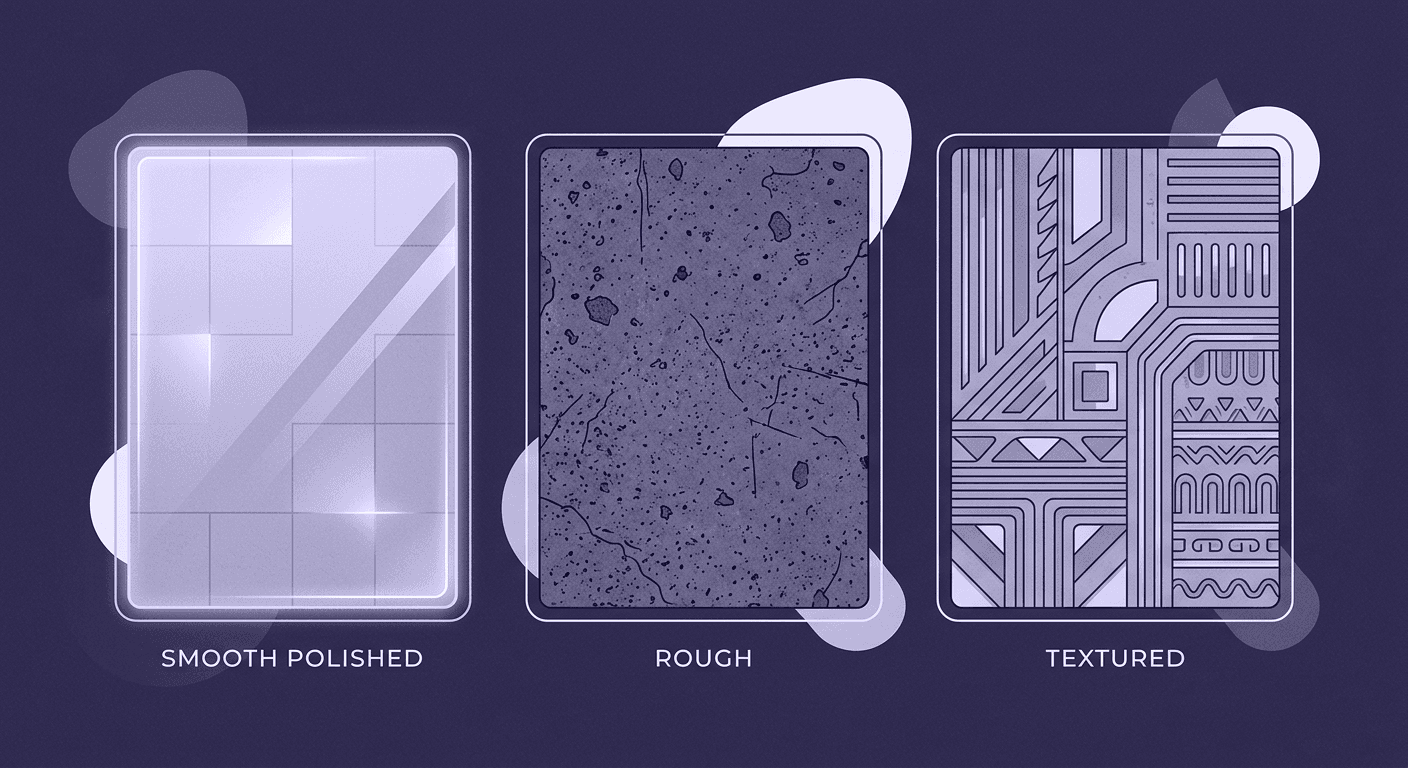
- Rough textures feel rugged, natural, and authentic. They suggest durability and a connection to the raw, unfiltered world.
- Smooth textures communicate elegance, modernity, and precision. A perfectly polished surface feels clean, controlled, and sophisticated.
- Soft textures evoke comfort, safety, and gentleness. They are approachable and nurturing, creating a sense of calm.
Aligning your product's feel with your brand's core values is critical. You wouldn't use a coarse, unrefined texture for a luxury skincare line, just as you wouldn't use a delicate, polished finish for a rugged power tool. The texture has to match the story you’re telling.
How texture communicates brand personality
Unpack this with two clear examples. One look at these, and you'll see how texture communicates brand personality without a single word.
Case study 1: An outdoor brand using rugged textures for durability
Think of a brand like Filson or Patagonia. Their products often feature heavy-duty canvas, thick-grain leather, and reinforced stitching. These are not just functional choices; they are brand statements. The slightly coarse, rugged product design texture says, “I am built to last. I can handle the wilderness. I am reliable.” This tactile experience reinforces the brand’s promise of durability and adventure every time the customer zips up their jacket or grabs their bag. The texture is the brand’s adventurous personality made tangible.
Case study 2: A luxury brand using smooth, refined surfaces for elegance
Now, consider a luxury audio brand like Bang & Olufsen. Their products are a masterclass in refined surfaces. They combine cool, anodized aluminum with warm, fine-grained wood and soft, woven fabrics. The seamless transition between these materials, the way the smooth metal meets the precisely finished wood communicates mastery, precision, and elegance. Holding one of their remotes, you feel the quality in its weight and flawless finish. The texture whispers sophistication and signals that this is an object of expert craftsmanship, reinforcing its premium price point and design-led brand personality through texture.
A strategic guide to product design texture
Knowing that texture is important is one thing. Implementing it systematically is another. You can't just pick textures that look good; they need to work for the brand, the product, and the user. It requires a framework, not just a feeling.
How to choose textures that align with your brand
So, how do designers choose textures that align with brand personality? Start with your brand archetype. This simple framework can help you translate abstract brand values into concrete material choices.
1. Identify your brand archetype: Are you The Hero (strong, competent), The Creator (innovative, expressive), The Caregiver (nurturing, supportive), or The Sage (wise, trusted)?
2. Map textures to archetypes:
The hero: Think protective, resilient surfaces. Brushed metals, reinforced composites, thick canvas, and grippy, functional patterns.
The creator: Focus on unique, expressive materials. Think molded plywood, recycled plastics with interesting flecks, generative patterns, or even unfinished, raw surfaces that show the process.
The caregiver: Use textures that are soft, warm, and inviting. Smooth, matte silicone, soft-touch coatings, natural woods, and gentle, woven fabrics.
The sage: Prioritize textures that feel refined, timeless, and authentic. Consider aged leather, smooth stone, matte ceramics, or heavy, quality paper.
3. Balance aesthetics, function, and message: The chosen texture must not only look right and feel right for the brand, but it also has to be functional. A rugged texture on a handle should provide grip. A smooth texture on a kitchen appliance should be easy to clean. Your final choice lives at the intersection of these three considerations.
Integrating texture into your brand's visual identity elements
To ensure consistency, texture can't be a one-off decision. It needs to be a core part of your brand's DNA, just like your typography or color palette. The goal is to build a cohesive texture library within your design system.
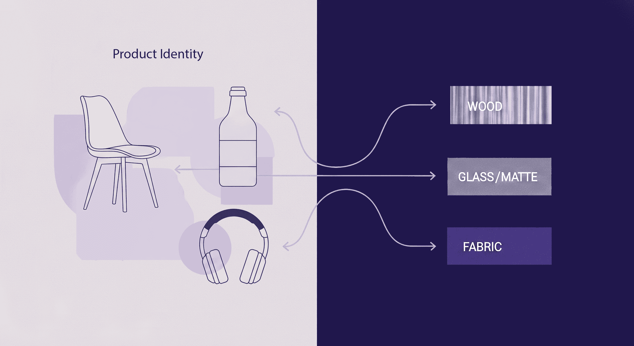
This isn't about having hundreds of options. It's about defining a few core textures that represent your brand. For instance, a tech company might define its primary texture as bead-blasted aluminum, its secondary texture as soft-touch matte silicone, and its accent texture as laser-etched microfiber.
By codifying these visual identity elements, you create a playbook. This ensures that every product, from a flagship device to a minor accessory, feels like it came from the same brand. It makes your design language consistent, from the earliest digital mockups all the way to the physical product on the shelf.
From concept to reality: Streamlining your workflow
The distance between a great concept and a final, approved product can be filled with endless feedback loops and costly prototypes. A strategic approach to texture doesn’t just build a better brand; it builds a smarter workflow.
Using digital texture to enhance brand storytelling
We've all been in that review where stakeholders just can't feel the design from a flat render. They can't grasp the quality or the intended experience. This is where realistic, high-fidelity digital materials become a game-changer. Using digital texture to enhance brand storytelling means your renders do more than just show shape and color, they communicate quality, feel, and intent.
When you can show exactly how light will play across a brushed metal surface or how a woven fabric will look under different conditions, you’re closing the imagination gap. Stakeholders can see the final product's quality before a single physical part is made. This builds confidence, accelerates approvals, and drastically reduces the rounds of expensive, time-consuming physical prototypes. You’re not just designing; you’re pre-selling the final experience.
Aligning your team with clear product surface communication
Inconsistency kills great design. It happens when the design team’s vision gets lost in translation between marketing, engineering, and manufacturing. A shared, defined language for texture is the solution.
When premium is no longer a vague adjective but refers to a specific material and finish in your texture library (e.g., Matte Finish P-04 on ABS plastic), everyone is on the same page. This is what clear product surface communication looks like. It aligns your entire pipeline.
- Designers can specify textures with precision.
- Marketers can build stories around tangible product attributes.
- Engineers know the exact material and manufacturing requirements.
The payoff is huge. You get a stronger, more cohesive brand story that is faithfully executed in every product. And just as importantly, you get a more efficient, aligned, and collaborative design pipeline. Less ambiguity, faster decisions, and better products. That’s the strategic power of texture.
What your brand feels like
Texture isn't just a finish. It's the first thing a customer touches, the physical proof that confirms or contradicts your entire brand story. It’s the handshake. And when you treat it with the same strategic weight as your logo, you change the whole game.
This isn’t about adding another step to your workflow. It’s about making the whole pipeline smarter. It’s how you kill those endless prototype cycles and get straight to a design that feels as good as it looks. When your texture library is as defined as your color palette, every designer, marketer, and engineer on your team is speaking the same language.
You’ve always had the eye for great design. Now you have a framework for making that design tangible. So go build a brand that people don’t just see, but feel and believe in.

Mira Kapoor
Mira leads marketing at Texturly, combining creative intuition with data-savvy strategy. With a background in design and a decade of experience shaping stories for creative tech brands, Mira brings the perfect blend of strategy and soul to every campaign. She believes great marketing isn’t about selling—it’s about sparking curiosity and building community.
Latest Blogs

A Practical Guide for How to Choose The Right Concrete Texture fo...
3D textures
PBR textures

Mira Kapoor
Apr 29, 2026

VR Textures in Unreal Engine: A Beginner’s Guide to Setup, Optimi...
3D textures
AI in 3D design

Max Calder
Apr 27, 2026

360 Environment Textures vs Traditional Textures: Key Differences...
AI in 3D design
PBR mapping

Max Calder
Apr 24, 2026
