A Practical Guide to Mastering PBR Textures for Architectural Visualization
By Max Calder | 31 July 2025 | 15 mins read
Table of contents
Table of Contents
How many hours have you lost tweaking a specular map, only to watch your perfectly textured scene fall apart the moment you change the lighting? We’ve all been there, fighting with materials that feel more like a fragile magic trick than a reliable tool. This post is your guide to moving past that frustrating cycle. We’re going to unpack how a Physically-Based Rendering (PBR) workflow isn’t just about swapping texture maps,it’s a fundamental mindset shift that delivers more realistic results with less guesswork. We'll look at how to master everything from wood and stone to glass and steel, giving you a practical approach to creating visuals that don't just look real, but feel real.

What’s the real advantage of PBR?
Physically-Based Rendering (PBR) is not just a new set of texture slots; it's a fundamental shift in how we approach materials. Think of it less like painting a picture of wood and more like teaching the computer the physics of wood. Instead of faking how a surface reacts to light, you’re defining its inherent physical properties: its color (Albedo), its microscopic texture (Roughness), and whether it’s a metal or not (Metallic). The renderer does the rest.
Moving beyond flat textures to materials that feel real
This makes a world of difference for client-facing visualizations. When materials react correctly to light, the entire scene gains a layer of subconscious believability. Clients might not know why it looks better, but they’ll feel it. They'll see a space that feels grounded and tangible, not a sterile CG image. This builds trust and leads to faster approvals because you’re presenting a vision that feels like a place they could actually step into.
How PBR helps you master light and shadow
This is where PBR textures in architecture become a workflow superpower. Because PBR materials are based on real-world physics, they react consistently and accurately to any lighting condition. That oak flooring you perfected for the morning sun will look just as convincing under the soft glow of interior lights at dusk. The metallic sheen on a window frame will catch the sunset just as beautifully as it reflected the bright afternoon sky.
This predictability is liberating. You can set up your materials once, confident that they’ll hold up across different lighting scenarios, camera angles, and even animations. It frees you from endless, redundant tweaks and lets you focus on what you do best: crafting a beautiful and compelling image. You spend less time fighting the render engine and more time being an artist.
Case study 1: Nailing natural materials in a residential project
Start with something every architectural visualizer wrestles with: making natural materials like wood and stone look authentic, not synthetic. These materials are deceptively complex. They don’t just need to look right in isolation; they need to behave under light, up close and at a distance, and across different surfaces in the same room. Because when natural textures feel off, the whole scene suffers, but when they’re dialed in, everything clicks into place.
From photo to photoreal: Building a PBR workflow for wood and stone
The real magic happens in the PBR maps. When you're trying to improve your architectural rendering with a PBR workflow, these are the maps that do the heavy lifting for organic surfaces:
- Albedo: This is your base color, but it must be pure. Your goal is to capture the wood's color without any baked-in lighting or shadows. A common mistake is using a photo with strong directional light, which clashes with the lighting in your scene. Use tools to de-light your textures, ensuring the Albedo is just clean, flat color information.
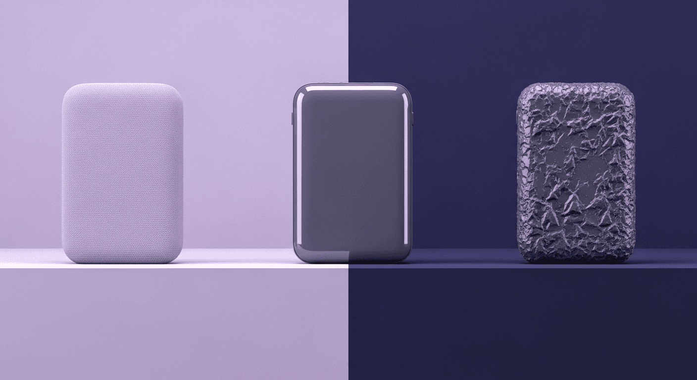
- Roughness: This is arguably the most critical map for realism. For wood, the roughness map tells the renderer which parts are polished smooth and which are raw and diffuse. Think about the grain, the softer parts might be more porous (higher roughness) while the harder, darker grain is more reflective (lower roughness). These subtle variations are what break up the uniformity and make the surface feel like you could touch it.
- Normal: While displacement maps add real geometry, a good normal map provides high-frequency surface detail, the tiny cracks, pores, and grain patterns, without adding a single polygon to your model. For the slate fireplace, the normal map would define the craggy, uneven surface that makes it feel massive and solid.
The payoff: Achieving realistic material rendering that feels authentic
As the camera dollies in, you notice how the light catches the edge of the wood grain. You see soft, broad highlights on the rougher parts of the stone and sharp, pinpoint reflections on a polished knot in the oak beam. The shadows pool realistically in the crevices of the slate. Even the dust and tiny scuffs added via subtle grunge maps blended into the roughness tell a story.
This is the power of PBR textures in architecture. It’s not just about making things look photoreal in a technical sense. It’s about achieving authenticity. The subtle imperfections are what trick the human eye into believing the image. The final render doesn’t just show the client a design; it makes them feel the warmth of the fireplace and the solidness of the wood.
Case study 2: Tackling glass and steel on a commercial facade
Now turn to the sleek, high-stakes world of commercial architecture, where glass, steel, and reflection rule the visual language. These materials may seem simpler on the surface, but anyone who’s tried to render a convincing facade knows the truth: metals and glass are unforgiving. The tiniest mistake in reflectivity or roughness will break the illusion instantly.
Getting reflections right: A PBR approach to metals and glass
For these materials, two maps are your primary tools:
- Metallic: This map is usually a simple binary black (0.0) for non-metals (dielectrics) and white (1.0) for metals. It fundamentally changes how the material is calculated. For the steel mullions, you’d use a white value. For the glass, it remains black. Using this map correctly tells the render engine to use the appropriate physical formulas, which is the first and most important step.
- Roughness: Just as with organic surfaces, roughness is key. For the glass panes, a very low roughness value (near black) creates crisp, clear reflections. For the brushed steel, you'd use a higher roughness value to create soft, diffused reflections. To get that signature brushed look, you’d use an anisotropic map to stretch the highlights horizontally or vertically, perfectly mimicking how light scatters across a brushed surface.
The beauty of this approach is that you’re not faking anything. You’re describing the surface to the renderer, and the renderer handles the complex interplay of light, reflection, and refraction. The result is a facade that reflects its surroundings with stunning accuracy, from the clouds in the sky to the traffic on the street below.
How PBR streamlines the look of complex modern designs
Because your materials are physically accurate, they hold up in any lighting. The glass and steel facade will look just as convincing at sunrise as it does at high noon or on an overcast day. The reflections and highlights will shift and change realistically as the sun moves across the sky. This consistency means you can render from any angle, at any time of day, without having to go back and tweak your materials for every shot.
This directly benefits your 3D architectural modeling pipeline. You can focus on building a single, robust master scene. This not only saves an immense amount of time but also ensures visual consistency across the entire set of deliverables, stills, animations, and even real-time presentations. The design looks cohesive and professional because its underlying materials are behaving like they would in the real world.
The hard part: Bridging the digital-to-physical gap
This is the struggle that separates good renderers from great ones. It's the challenge of bridging the gap between a digitally perfect texture and the beautiful, chaotic complexity of a real-world material.
Why a perfect texture can still feel wrong in the scene
A downloaded texture swatch, no matter how high-quality, lacks this environmental context. It represents the material in a sterile lab, not in a living, breathing space. When you tile that perfect texture across a large surface, you’re just multiplying the sterility, and our brains are incredibly good at spotting that repetition and artificiality.
Common hurdles in implementing PBR textures (and how to clear them)
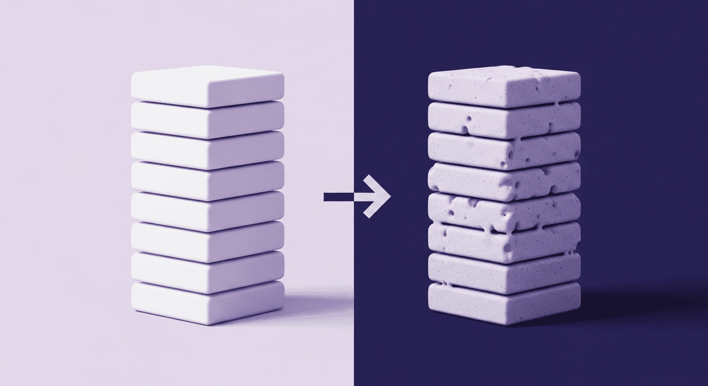
- The uniform, plasticky look: This is almost always a problem with the roughness map. A single roughness value creates a uniform, factory-fresh sheen.
The fix: Break it up. Use procedural maps or blended box mapping with grunge textures to introduce subtle variations. Layer in fingerprints, smudges, and fine scratches. Even a brand-new surface isn't perfectly clean. These micro-imperfections are what make a material feel grounded. - Materials don't sit together: You have a beautiful wood texture and a great concrete texture, but in the scene, they look like they were photoshopped together. They don’t feel like they belong in the same room.
The fix: Calibrate your materials in a consistent look-dev environment, not in your final scene. Set up a neutral scene with balanced, full-spectrum lighting (a simple HDRI of an overcast sky works great). Place a Macbeth color chart and a chrome and grey ball in the scene. Adjust your materials here until their brightness and saturation values feel correct relative to each other. This ensures that when you bring them into your final scene, they start from a balanced, physically plausible baseline. - Forgetting the story: The texture looks good, but it doesn't match the narrative of the space. A weathered wood texture doesn’t make sense in a hyper-modern, minimalist interior.
The fix: Think like a set designer. Before you even look for a texture, ask: How old is this material? How is it used? Is it exposed to the elements? Is it well-maintained? Answering these questions will guide you to add the right kind of wear, dirt, and context, making the material a believable part of the world you’re building.
Your practical PBR toolkit and pipeline
At this point, you're probably wondering: “Okay, but what tools should I actually be using and how do I organize all of this without losing my mind?” We’ve got you covered. This section is a no-fluff breakdown of the essential tools, texture sources, and workflow habits that’ll keep your PBR pipeline clean, consistent, and fast. Whether you're building materials from scratch or working with libraries, these are the practical steps to help you stay focused on the art, not digging through folders or tweaking the same setting for the tenth time.
Our recommended tools for creating and managing PBR assets
For creating custom textures:
- Texturly: If you’re looking to quickly generate seamless, tileable textures with automatic PBR map creation, Texturly is a powerful addition to your workflow. It’s especially useful when you need consistent, high-quality textures on a tight timeline, great for building large libraries or customizing base materials without diving deep into manual map creation. Think of it as your go-to for speed and scalability without sacrificing realism.
- Substance painter: This is the industry standard for a reason. If you need to texture a unique piece of furniture or add specific wear-and-tear to a surface, Painter gives you incredible power. Its layer-based system and smart materials let you paint with realistic effects like dust, rust, and edge wear procedurally.
- Quixel mixer: An amazing tool for blending and customizing scanned assets. You can take a base material from the Megascans library and quickly add new layers of detail like moss, puddles, or dirt in a way that feels incredibly natural and intuitive. It's perfect for creating complex, realistic ground planes or weathered walls.
For high-quality, ready-made materials:
- Quixel Megascans: The library is enormous, and the quality is second to none. For natural and man-made surfaces alike, it’s often the fastest way to get a photorealistic result. Their assets are already PBR-calibrated, so you can use them with confidence.
- Poliigon: Founded by Andrew Price (Blender Guru), Poliigon offers a vast library of high-quality textures with a focus on clean, easy-to-use assets. They offer excellent controls for things like roughness and reflection, and their seamless textures are top-notch.
Plugging PBR into your existing workflow without the headache
1. Build your reference board: Before you touch a 3D tool, gather real-world reference photos. Don't just look for color; study how the material reflects light, how it ages, and how it's constructed. This is your ground truth.
2. Source or create with a plan: Based on your reference, decide whether to use a pre-made asset or create a custom texture. If you’re using a library, download all the necessary maps (Albedo, Roughness, Normal, etc.) at once.
3. Use a look-dev scene: Don't build materials directly in your final, complex scene. Test and calibrate them in a simple, neutral lighting environment first. This isolates the material so you can judge it on its own merits without being distracted by dramatic lighting or composition.
4. Organize your library like a pro: This is a lifesaver. Create a centralized asset library on your server or local drive. Develop a clear and consistent naming convention. For example:
MaterialCategory_MaterialName_MapType.ext
Wood_OakFlooring_Light_Albedo.png
Wood_OakFlooring_Light_Roughness.png
This simple habit saves countless hours searching for files and makes it easy for team members to find and use assets correctly. It ensures consistency across every project your studio touches, which is crucial for managing tight deadlines and maintaining a high standard of quality.
Beyond the pixels: Making your renders feel real
So, we’ve unpacked the tools, the workflows, and the case studies. But if you take one thing away from this, let it be this: PBR isn’t just a technical upgrade. It’s a philosophical one. It’s the shift from faking light to simulating physics, and that changes everything.
The real magic isn’t in an 8K texture map. It’s in bridging that gap between the digital and the physical, the moment you stop just applying a material and start telling its story. Those subtle scuffs on the floor, the faint water stain near a window, the way dust settles differently on a rough surface versus a smooth one, that’s not noise. That’s character. That’s history. That’s what turns a sterile CG image into a place someone can imagine themselves living or working in.
And here’s the best part: because a solid PBR pipeline handles the heavy lifting of how light behaves, it frees you up to be the artist. You can spend less time fighting with render settings and more time focusing on those narrative details that truly sell the vision. It’s a workflow that respects your time and elevates your craft.
So dive in. Build your library, calibrate your materials, and start looking for the stories in every surface. You’ve got the skills. Now you have a workflow that can keep up with your vision.

Max Calder
Max Calder is a creative technologist at Texturly. He specializes in material workflows, lighting, and rendering, but what drives him is enhancing creative workflows using technology. Whether he's writing about shader logic or exploring the art behind great textures, Max brings a thoughtful, hands-on perspective shaped by years in the industry. His favorite kind of learning? Collaborative, curious, and always rooted in real-world projects.
Latest Blogs

How 4K Seamless Textures Transform Flat CG Into Tangible Fabric
PBR textures
Fabric textures

Max Calder
Nov 21, 2025

Beyond Color and Gloss: How Plastic Texture Tells Your Product's ...
Product rendering
Texture creation

Max Calder
Nov 19, 2025

Decode Plastic Material Texture: The Team Language That Prevents ...
Product rendering
Texture creation

Mira Kapoor
Nov 17, 2025
