Transform Your Architectural Designs with PBR Textures: Case Studies & Insights
By Max Calder | 30 July 2025 | 13 mins read
Table of contents
Table of Contents
You know the feeling. You’ve spent weeks perfecting a design, but the final render just doesn’t do it justice. That custom-milled woodwork looks flat, the polished concrete feels plasticky, and the client can't quite see the beautiful, tangible space you have in your head. This guide is your bridge over that gap. We're going to unpack how a PBR (Physically Based Rendering) workflow does more than just create realistic images; it helps you communicate the true character of your materials so you can sell your vision with confidence. Forget just faking realism; this is about building a faster, smarter pipeline that gives you stunning visuals, quicker approvals, and the power to bring your most ambitious designs to life, all in-house.

What's the deal with PBR textures?
Before we dive into workflow tips or tool recommendations, let’s clarify why PBR matters in the first place. If you’ve ever wondered why your renders still feel a bit lifeless even with great lighting and composition, it probably comes down to how your materials are built. PBR textures don’t just add detail; they change the way your materials behave.
Why they're more than just a pretty picture for architects
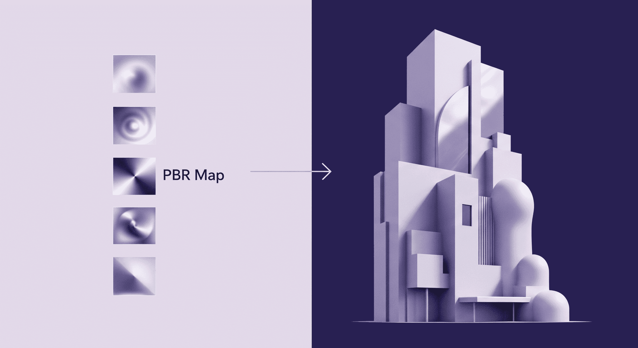
PBR, or Physically Based Rendering, changes the game entirely. It’s a shift in mindset. Instead of telling the software how a material should look, you tell it what the material is. You define its physical properties how rough it is, whether it's metal, and the render engine’s lighting physics does the rest.
This is the crucial difference: PBR textures allow light and surfaces to interact just as they do in the real world. A polished concrete floor won't just have a generic sheen; it will reflect light sources with sharp clarity. A rough, porous brick wall will diffuse light softly, creating a sense of tactile depth. You’re moving from creating a pretty picture to simulating a believable space. This isn't just an aesthetic upgrade; it’s a foundational step toward creating visuals that are not only stunning but also physically accurate.
Unpacking the core PBR maps you'll actually use
Albedo: This is the pure, even color of a surface, completely stripped of any lighting or shadow information. Imagine taking a photograph of a brick wall on a perfectly overcast day with no shadows; that’s your albedo. It’s the baseline truth of the material’s color. Getting this right is step one for any realistic material simulation.
Roughness: This is arguably the most important map for architects. It controls how light scatters across a surface. A perfectly smooth surface (like a mirror or polished chrome) has a low roughness value, creating sharp, clear reflections. A rough surface (like unfinished wood or natural stone) has a high roughness value, diffusing light and creating soft, blurry highlights. This single map is responsible for giving materials their unique character and finish.
Metallic: This one is straightforward, it’s a black and white map that tells the engine if a surface is metal or not. White areas are 100% metallic; black areas are non-metallic (or dielectric). This map fundamentally changes how reflections are calculated. Metals tint their reflections with their albedo color (gold has golden reflections), while non-metals have untinted, specular reflections. There’s no in-between; a surface is either metal or it isn’t.
Normal: Ever wonder how artists create intricate details like wood grain, concrete pores, or tile grout without building them into the 3D model? That’s the normal map. It’s a special RGB texture that fakes complex surface detail by telling the render engine how light should bounce off a surface as if those details were physically there. It adds incredible depth and realism without bogging down your scene with millions of extra polygons. It’s the secret sauce for high-fidelity surfaces.
Mastering how these four maps work together is the key to creating nearly any material you can imagine, from glass and steel to wood and textiles, with a level of realism that was once impossible to achieve in-house. And as you’ll see, this system is what makes your design workflow faster and more predictable.
Build your PBR workflow for architectural visualization
You’ve seen what PBR can do, but how do you actually make it part of your day-to-day process? This section is all about building a streamlined, reliable workflow that fits into your existing pipeline. Whether you're sourcing ready-made textures or crafting your own, we’ll walk through the practical steps to get your materials organized, optimized, and ready for production-grade results—without the trial and error.
Finding or creating your library of go-to textures
Lean on the pros. For most studios, creating every texture from scratch is impractical. Services like Quixel Megascans, Poliigon, and Textures.com are the industry standard for a reason. They offer vast libraries of pre-made, physically accurate PBR materials that are ready to go. The investment pays for itself in time saved almost immediately.
Consider a custom touch. For signature projects or unique materials, tools like Texturly and Substance Sampler (formerly Alchemist) allow you to create your own PBR materials from a single photograph. You can snap a picture of a specific textile or stone on-site and turn it into a fully functional, tileable PBR texture in minutes.
Organize for speed. Don’t just dump your downloads into one massive folder. A good organization system is a lifesaver. Structure your library logically: /[Material Type]/[Sub-Type]/[Material Name]. For example: Textures/Wood/Flooring/Oak_Herringbone_Washed. This way, you and your team can find exactly what you need in seconds, not hours. A little discipline here goes a long, long way.
Plugging textures into your rendering pipeline
Here’s the basic process: you load a PBR material, and you’ll see input slots for each map, Albedo (often called Diffuse or Base Color), Roughness, Metallic, and Normal. You simply plug the corresponding texture file into each slot. That's it. The material is 95% of the way there.
For instance, in V-Ray, you’d connect your roughness map to the Reflection Roughness slot and your normal map to the Bump/Normal slot. The key here is consistency. Because the materials are physically based, that oak flooring texture will look correct whether it’s in a sun-drenched interior or a softly lit evening scene. You're no longer fighting the software to get a good result; you’re providing it with accurate data and letting it do its job. This predictable workflow frees you up to focus on the bigger picture, lighting, composition, and the overall mood of your design.
Case studies: See how PBR transforms real projects
Theory is great, but nothing beats seeing PBR in action. These real-world case studies show how switching to a PBR workflow transforms not just the visuals but the entire client experience. From cozy residential interiors to sleek commercial exteriors, you’ll see how texture maps do more than make things look pretty; they tell a tactile, believable story that clients instantly connect with.
Case study 1: Bringing warmth and texture to a residential interior
Consider a modern farmhouse interior. The design calls for wide-plank, reclaimed oak floors, a rough-hewn stone fireplace, and soft linen curtains. In a pre-PBR workflow, these surfaces might look generic. The wood is flat brown, the stone is a repeating pattern, and the curtains are stiff.
With a PBR workflow, everything changes. For the oak floors, the albedo map provides the rich, varied wood tones, while the roughness map defines the semi-gloss polyurethane finish. You can see how light from the windows creates soft, elongated highlights that stretch across the planks. The normal map adds the subtle grain and saw marks, making the floor feel real enough to touch. For the fireplace, the PBR material captures the deep crevices and porous nature of the stone, showing how it absorbs light rather than reflecting it. This is how PBR textures improve architectural rendering for client buy-in: the client isn’t just seeing a floor plan; they’re seeing a future home where they can imagine running their hand over the stone mantelpiece. The materials tell a story of comfort and quality.
Case study 2: Creating a striking commercial facade with glass and metal
Imagine a corporate headquarters featuring a curtain wall of dark glass and brushed bronze mullions. Using a physically based rendering architecture is non-negotiable here. The Metallic map instantly tells the engine that the mullions are metal, ensuring they reflect their surroundings with a warm, bronze tint. The Roughness map is then used to create the fine, linear highlights characteristic of a brushed finish, an effect that’s nearly impossible to fake convincingly with old methods. You can see how the reflections stretch and blur vertically along the mullions.
For the glass, PBR allows for incredible nuance. Instead of a perfectly transparent material, you can use a subtle roughness map to simulate the effect of anti-glare coatings or a slight frosting for privacy. This level of control means you can accurately test the design in different lighting conditions. How does the facade look in the sharp light of high noon versus the soft glow of dawn? Because the materials react realistically to light, you can generate renders that confidently show the client and the planning commission exactly how the building will appear and interact with its environment throughout the day. You’re no longer hoping it will look good; you’re proving it will.
The real magic: Using PBR to sell your design vision
Great design isn’t just about what you create, it’s about how well you communicate it. This is where PBR shines. It closes the gap between your internal vision and your client’s understanding, translating material nuance into something they can see and feel.
Expert insight: Bridging the gap between your idea and their understanding
Think about it. As an architect, you have a fully formed vision in your mind. You know precisely the texture of the concrete, the sheen of the brass fixtures, the feel of the leather on a chair. The biggest challenge has always been translating that precise sensory idea into a medium the client can understand. Words like brushed or honed are subjective. A 2D drawing is abstract.
PBR closes that gap. It makes your design intent explicit and undeniable. When you show a client a render with a PBR material for honed black granite, they aren't just seeing a dark countertop. They are seeing the specific, soft, matte reflections that define that exact finish. There is no room for misinterpretation. PBR helps clients feel the space before it’s built, creating an emotional connection and building the confidence needed for them to sign off on your vision.
How to use your PBR workflow in architectural presentations
Because PBR materials are efficient and physically accurate, they are the backbone of modern, interactive presentations. You can now use real-time rendering engines like Unreal Engine, Enscape, or Twinmotion to let clients experience your design in virtual reality or through a dynamic walkthrough on a screen. They can see how the morning light streams in and plays across the polished floor, or how the metallic facade shimmers as they walk around the building.
This answers the ultimate client question: What will it really look like? with unprecedented clarity. When a client can see for themselves how a material choice affects the mood of a room under different lighting, the conversation shifts from speculation to collaboration. They become more confident in your decisions, leading to faster approvals and a shared excitement for the final product.
The payoff: Better visuals, faster approvals, and fewer revisions
A smart PBR workflow doesn’t just make things look better; it makes your entire design process more agile. Faster turnarounds, fewer revisions, more confident clients, and less reliance on outsourcing. This is where your investment in PBR pays off in time, trust, and ultimately, better business.
How a smart PBR workflow reduces costly outsourcing
By mastering PBR textures in architectural design in-house, you reclaim control. Your own team can produce stunning, photorealistic visuals for everything from initial concept pitches to final marketing materials. This dramatically shortens iteration cycles. When a client requests a different finish for the cabinetry, you can show them a photorealistic update in hours, not days. This agility not only saves a significant amount of money on outsourcing fees but also makes your firm more responsive and competitive.
You've got the eye. This is the engine to back it up.
That’s what a smart PBR workflow does. It’s not about getting lost in technical settings; it’s about having a reliable system that translates your vision to the screen with fidelity and speed. It’s an engine that backs up your creative choices with visual proof. By spending less time wrestling with rendering issues and more time focused on design, you can push your creative boundaries further and deliver work that not only wins projects but truly represents the quality of your firm’s vision.
Your vision, made tangible
For years, the conversation around rendering has been stuck on realism. But that was never the real goal, was it? The real goal has always been clarity.
PBR isn't just a technical upgrade; it's a translation tool. It takes the highly specific vision in your head, the precise sheen on a steel beam, the porous texture of a concrete wall, and makes it undeniable on screen. It bridges the gap between your architectural intent and your client’s understanding, turning subjective descriptions into objective, visual proof.
This changes everything about how you sell your work. Your next presentation won't just be a series of images; it will be a convincing experience. You’re no longer just showing a design; you’re building the confidence and excitement needed for a client to say "yes" without hesitation. You’ve always had the eye and the expertise. A smart PBR workflow is the engine that ensures everyone else can finally see what you see.

Max Calder
Max Calder is a creative technologist at Texturly. He specializes in material workflows, lighting, and rendering, but what drives him is enhancing creative workflows using technology. Whether he's writing about shader logic or exploring the art behind great textures, Max brings a thoughtful, hands-on perspective shaped by years in the industry. His favorite kind of learning? Collaborative, curious, and always rooted in real-world projects.
Latest Blogs

How 4K Seamless Textures Transform Flat CG Into Tangible Fabric
PBR textures
Fabric textures

Max Calder
Nov 21, 2025

Beyond Color and Gloss: How Plastic Texture Tells Your Product's ...
Product rendering
Texture creation

Max Calder
Nov 19, 2025

Decode Plastic Material Texture: The Team Language That Prevents ...
Product rendering
Texture creation

Mira Kapoor
Nov 17, 2025
