Stop Painting Your Metallic Maps, Start Switching Them
By Max Calder | 1 October 2025 | 14 mins read
Table of contents
Table of Contents
What if the most powerful map in your PBR workflow isn't the one you spend hours painting, but the one that should be almost entirely black and white? This guide is all about mastering the metallic map. We're going to unpack the simple physics that make it a binary switch, not a creative playground, and give you a practical, production-ready workflow for defining true metal and non-metal surfaces that just work. Nailing this is the difference between fighting with your shader and making it sing. We’ll break down the 0 or 1 rule that trips up even seasoned artists, see how it talks to your other textures, and build a map that’s clean, correct, and easy to change when those last-minute notes roll in.

Unpack the core idea: What are metallic maps in PBR?
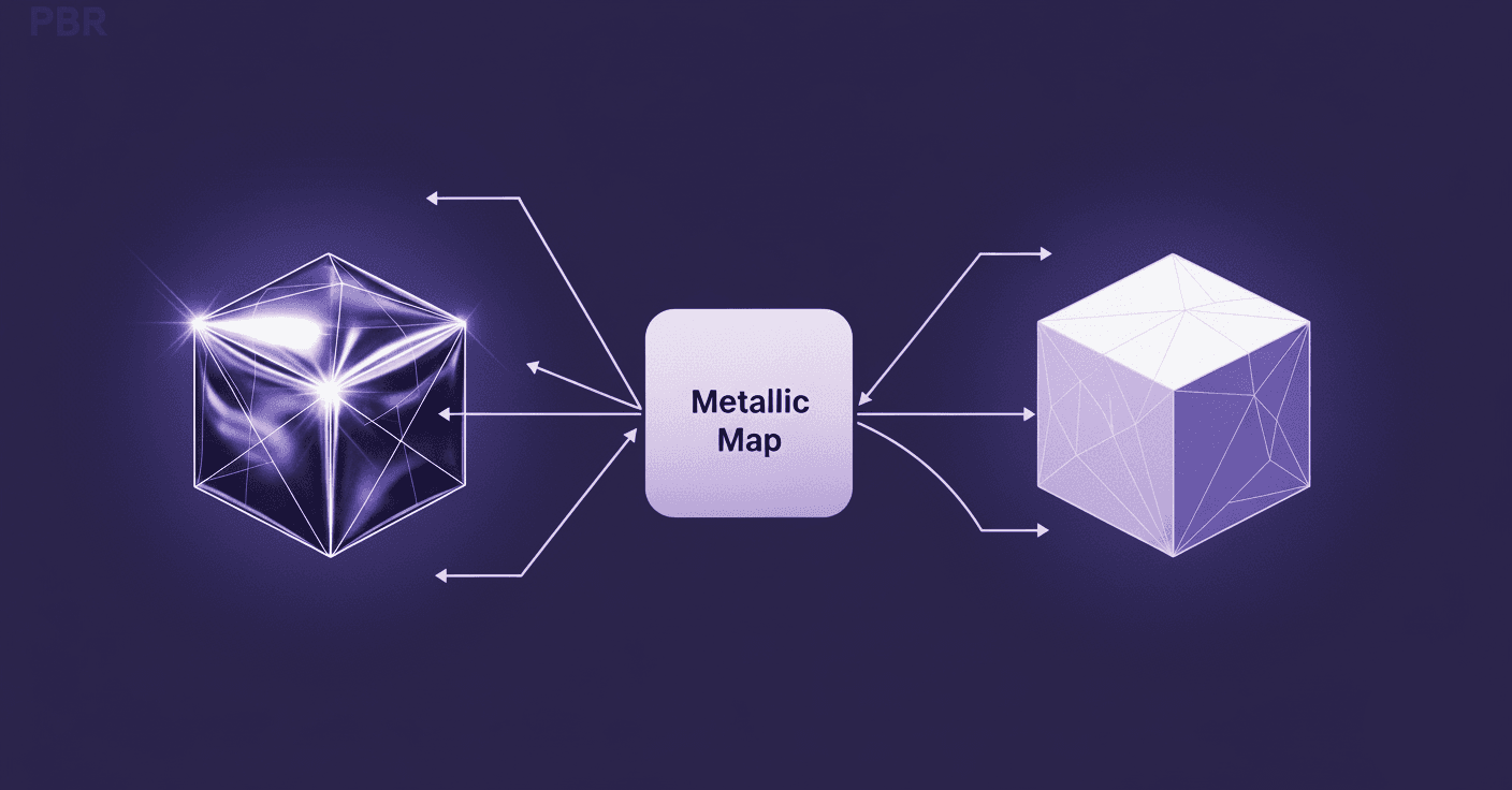
The metallic map is your shader’s switch for telling it one simple thing: is this part of the surface a raw metal, or is it not? It’s a grayscale texture, but its job is fundamentally binary. It’s the bouncer at the door of the PBR shader, deciding which material, conductor, or dielectric gets in.
Differentiate between metal and non-metal surfaces
At the heart of Physically Based Rendering (PBR) is an attempt to mimic real-world physics. In the real world, materials handle light in one of two ways. This is the core concept you need to nail down.
- Conductors (metals): Think of materials like iron, gold, copper, and aluminum. When light hits these surfaces, it reflects off them almost entirely. They absorb very little light and have no diffuse color in the traditional sense. Their perceived color comes from the light they reflect. In your metallic map, these surfaces get a value of 1 (pure white).
- Dielectrics (non-metals): This is everything else, plastic, wood, fabric, skin, ceramic, stone, dirt. When light hits these surfaces, some of it reflects, but a significant portion penetrates the surface, scatters around underneath, and then exits. This subsurface scattering is what gives these materials their diffuse color. For these, your metallic map uses a value of 0 (pure black).
Getting this right is non-negotiable for believable renders. When you tell the PBR engine that a surface is a metal (by making it white in the metallic map), the engine changes its behavior. It completely ignores the diffuse component and treats the Base Color map as the reflectance value instead. For non-metals, it’s business as usual; the Base Color map defines the diffuse color.
Grasp the 0 or 1 rule: Why metallic maps are binary
Most artists get tripped up here. They see a grayscale map and think it’s an invitation to paint with a full range of values. It’s not. In the physical world, a material is either a metal or it isn't. There’s no such thing as a semi-metal or a material that's 50% plastic and 50% steel in its raw state.
So, your metallic map should be almost entirely black and white. No shades of gray for raw materials.
“But what about…?” I hear you ask. Yes, there are exceptions, but they aren't what you think. Gray values are reserved for one specific purpose: representing a thin transitional layer on top of a surface. Think about:
- A fine layer of non-metallic dust is settling on a sheet of steel.
- Thin grime or dirt accumulated in the crevices of an aluminum panel.
- The boundary where paint (non-metal) is chipping away to reveal the metal underneath.
In these cases, the gray value tells the shader that the pixel isn't pure metal or pure non-metal. It’s a mix. But this is a texturing effect, not a property of the underlying material itself. Stick to the 0 or 1 rule for your base materials, and you’ll avoid 90% of the common issues artists face.
With the physics sorted, let's move on to the practical side, actually building this map without losing our minds during last-minute director feedback.
Author your metallic map: A practical workflow
Alright, theory is great, but production deadlines don’t wait. A clean, efficient workflow is what separates a good artist from a great one. Creating a metallic map should be a fast, decisive process, not a lengthy painting exercise. Here’s how you build one that’s both accurate and easy to modify.
Step 1: Isolate materials in your texturing software
Before you even think about painting black or white, you need perfect masks. This is the single most important step for a non-destructive 3D rendering workflow. Don’t paint your metallic map by hand across the entire UV layout; that’s a recipe for disaster when you get notes to change a material.
Instead, use your model’s built-in data to create clean selections. In tools like Substance Painter, Mari, or even Photoshop with a 3D pipeline, this means leveraging:
- Material IDs: If your model is baked with color-coded material IDs, you can select every part assigned to Steel or Plastic with a single click.
- Polygon selections / Face sets: Use these to create masks for specific geometric areas.
- Object or mesh names: Isolate parts of your asset by name to keep things organized.
Set up folders or layer groups for each material type (e.g., Painted Metal, Raw Steel, Rubber Grips). By creating masks for these groups first, you ensure that any changes you make are contained and easily editable. This is how you handle late-night change requests without re-texturing the whole asset.
Step 2: Assign pure white or black values
With your masks in place, this part is simple. No finesse, no delicate brush strokes. Just clean, absolute values.
- For every material group that represents a raw metal, create a fill layer and set its value to pure white (1.0).
- For every non-metal material group, create a fill layer and set its value to pure black (0.0).
That’s it. This forms the foundation of your metallic map. At this stage, your map should look like a high-contrast, black-and-white diagram. This clean base ensures your shader interprets each surface property correctly and predictably.
Step 3: Refine transition areas and surface details
Now comes the artistry. This is where you add the story, the dust, the rust, the wear and tear. This step is key to understanding metal vs non-metal surfaces in PBR for truly realistic results.
Let’s say you have a painted metal panel. The paint itself is a dielectric (black), but the metal underneath is a conductor (white). Where the paint has chipped away, you need to reveal the metal.
- Start with your base non-metal paint layer (metallic value of 0).
- Add a new layer on top with a metallic value of 1 (for the raw metal).
- Now, use a mask on this metal layer to control where it appears. You can use smart masks, procedural noise, or hand-painted details to create the chipping effect.
For effects like dust or grime layered over a metal surface, you can introduce subtle gray values. Create a new fill layer with a dark gray value (e.g., 0.1 or 0.2) in the metallic channel and use a procedural mask like an ambient occlusion or curvature generator to place it in crevices. This subtly tells the shader that these specific areas are less metallic, breaking up the perfect finish without violating the core physics.
By building your map in this layered, procedural way, you create something that’s not just physically accurate, but also incredibly flexible.
Connect the dots: How metallic fits into PBR texture mapping
Your metallic map never works in isolation. It’s a critical part of a team, constantly talking to the Base Color and Roughness maps to define the final look of a surface. Understanding this interplay is what separates artists who follow tutorials from those who can create any material from scratch.
See how metallic values affect the base color map
This is a major point of confusion for many artists. The metallic map acts as a switch that fundamentally changes how the renderer interprets your Base Color map.
- When metallic is black (0.0 - non-metal): The renderer treats the Base Color map as the diffuse color. This is the color you see when light scatters inside the material. For a red plastic ball, the Base Color is simply red. The shader will also calculate a fixed, minimal amount of reflection (around 4% for most dielectrics).
- When metallic is white (1.0 - metal): The game changes completely. The renderer now treats the Base Color map as the reflectance value or F0 (Fresnel at zero degrees). Metals don’t have diffuse color. The colors you see in your Base Color map for gold, copper, or brass are not diffuse; they are the specific wavelengths of light that the metal reflects. For example, a physically accurate Base Color for gold isn’t just a generic yellow; it’s a specific RGB value like (255, 215, 0) that represents its reflectance properties. The diffuse component is effectively turned off.
Getting this wrong is a common source of problems. If you put a dark color in the Base Color map for a surface you’ve defined as metal, the metal will look unnaturally dark or black because it’s reflecting very little light. Rule of thumb for metals: Keep your Base Color values bright (typically above an RGB value of 180).
Balance your metallic map with the roughness map
If the metallic map asks “Is it metal?”, the roughness map asks “How scattered are the reflections on its surface?” These two maps work together to define the character of a material.
Think about these two examples:
- A polished chrome sphere: This is perfectly smooth. Its metallic value is 1 (white), and its roughness value is very low, close to 0 (black). Light reflections are sharp, clear, and mirror-like.
- A brushed aluminum pan: This is also 100% metal. Its metallic value is 1 (white). However, its surface is covered in tiny scratches and imperfections, making it rough. Its roughness value is high, closer to 1 (white). Light reflections are scattered and blurry, creating a soft, broad highlight instead of a sharp one.
Both are metals, but their appearances are worlds apart, and the roughness map is responsible for that difference. This interaction is a cornerstone of physically based rendering techniques. Never author one map without considering the other. A change in roughness can drastically alter how a metallic surface feels, shifting it from a mirror to a matte object without ever touching the metallic map itself.
Level up: Advanced PBR texture mapping techniques
Okay, you’ve mastered the fundamentals. You can separate conductors from dielectrics, and you know how the maps interact. Now, let’s tackle the complex assets that end up in a real production pipeline, the ones with layers of history, wear, and detail.
How to create accurate metallic maps for complex assets
When you're texturing a hero asset, you’re not just defining materials; you’re telling a story. This is how to create accurate metallic maps in 3D rendering that go beyond simple black-and-white blocking.
Your best friends here are procedural generators and masking. Let’s take the example of a painted machine part that’s seen heavy use.
- Establish your base layers: Create two fill layers. The bottom layer is the raw metal (Metallic: 1.0). The top layer is the paint (Metallic: 0.0).
- Generate edge wear: Add a black mask to the paint layer to hide it completely, revealing the metal underneath. Now, add a generator to that mask. Use a Curvature map as the input. A curvature generator is brilliant at detecting sharp edges and corners exactly where paint would chip and wear away first. Tweak the generator’s settings to control the intensity and scale of the wear. This instantly creates believable chipping along exposed edges.
- Add surface scratches: You can layer another effect on top. Add a fill effect to your mask and plug in a procedural scratch texture. This will make it look like the paint has been scraped off in certain areas, not just worn down at the edges. Because you’re working with masks, you can easily adjust the scratch intensity or even swap out the texture without destroying your work.
- Layer non-metallic grime: What about dirt? Dirt is a dielectric. Create a new group on top of everything called Grime. Inside, create a fill layer with its Metallic value set to 0 (black). Use a smart mask, like an Ambient Occlusion generator, to place this dirt in the crevices and cavities of the model. Now you have a non-metallic material realistically accumulating on top of both the painted surfaces and the exposed metal.
This layered, procedural approach is one of the most powerful advanced PBR texture mapping techniques. It’s non-destructive, art-directable, and incredibly efficient.
Troubleshoot common rendering issues
Even with a perfect workflow, things can look wrong in the final render. Knowing how to diagnose problems quickly is essential. Here are a few common issues and how to fix them.
- Problem: My metal looks black or way too dark.
- The cause: This almost always happens for one of two reasons. First, your Base Color value is too dark. Remember, for metals, Base Color is reflectance. A dark value means it reflects very little light. Second, your scene lacks sufficient reflections. Metals get their visual definition from what they reflect. If your object is sitting in a black void, it will look black.
- The fix: Make sure your Base Color values for metals are bright (generally above 180 sRGB). Then, ensure your scene has a proper lighting setup with an HDRI or reflection probes to give the metal something to reflect.
- Problem: My non-metal (like plastic or wood) looks slightly metallic or has a weird sheen.
- The cause: You have stray grey values in your metallic map. Even a small value like 0.1 can tell the shader to start treating the surface more like a metal, leading to an odd, plasticky-metal look. This often happens from accidentally painting with a grey brush or from resizing/compressing textures, which can blur the pure black and white values.
- The fix: Open your metallic map and use a levels or curves adjustment to crush any light grey values down to pure black. Ensure all your dielectric surfaces are 100% black (0.0) in the map.
- Problem: The edges where paint is chipped look dark or strange.
- The cause: Often, the Base Colour map doesn't align with the Metallic map. You might have the correct white value in your metallic map to show exposed metal, but the Base Colour map still has the paint colour in that area.
- The fix: Make sure your masks are consistent across all channels. The same mask you use to reveal the metal in the metallic map should be used to reveal the metal’s reflectance colour in the Base Colour map. This is why a non-destructive, mask-based workflow is so critical for keeping your rendering pipeline techniques clean and predictable.
Mastering the switch
The metallic map isn't a canvas for you to paint on; it's a switch you need to flip. For years, we’ve been handed grayscale maps and told to be creative, but the physics is simpler and more rigid than that. Your job isn't to blend a surface into being "kinda-sorta-metal." It's to make a clean, confident decision: conductor or dielectric. On or off. White or black.
Getting this right changes everything. It’s the shift from guessing what looks good to knowing what is correct. When you build your textures this way with clean masks and absolute values, you’re not just painting anymore. You’re engineering a surface. Your workflow becomes faster. Your materials become more predictable. And when that last-minute note comes in to make the metal panels less worn, you’re not starting over. You’re just tweaking a mask. That’s not just a time-saver; it’s a career-saver.
You’ve got the theory and the workflow now. The real power isn't in the map itself, but in the confidence it gives you to create physically accurate materials that hold up under any lighting, in any scene. So go build something that sings. You’ve got this.

Max Calder
Max Calder is a creative technologist at Texturly. He specializes in material workflows, lighting, and rendering, but what drives him is enhancing creative workflows using technology. Whether he's writing about shader logic or exploring the art behind great textures, Max brings a thoughtful, hands-on perspective shaped by years in the industry. His favorite kind of learning? Collaborative, curious, and always rooted in real-world projects.
Latest Blogs

A Practical Guide for How to Choose The Right Concrete Texture fo...
3D textures
PBR textures

Mira Kapoor
Apr 29, 2026

VR Textures in Unreal Engine: A Beginner’s Guide to Setup, Optimi...
3D textures
AI in 3D design

Max Calder
Apr 27, 2026

360 Environment Textures vs Traditional Textures: Key Differences...
AI in 3D design
PBR mapping

Max Calder
Apr 24, 2026
