Mastering Realism: A Deep Dive into PBR Roughness Maps
By Max Calder | 6 October 2025 | 11 mins read
Table of contents
Table of Contents
You know the feeling. You’ve nailed the model, the albedo is perfect, but your material still looks a little… plastic. It’s a super common problem, and it usually has nothing to do with your color or normal maps. This guide is the deep dive you've been looking for. We're going to move past treating the roughness map like a simple gloss dial and get into the physics of how it actually controls light, giving you the practical workflows to make your materials not just look good, but feel tangibly real. Because mastering roughness is about more than just shiny or matte, it’s about storytelling. It's how you add history, wear, and subtle imperfections that convince the viewer’s brain they’re looking at something authentic.

What is a roughness map anyway?
You've plugged a roughness map into your shader a thousand times. You know black means shiny and white means matte. But most artists stop there, treating it like a simple gloss dial. They’re missing the point.
Your roughness map isn't just about making things shiny or dull. It’s the single most important texture for convincing the viewer’s brain that a surface is real. It’s the storyteller, adding history with smudges, wear, and moisture that other maps can’t.
From perfect mirrors to dull clay: Defining surface reflectivity
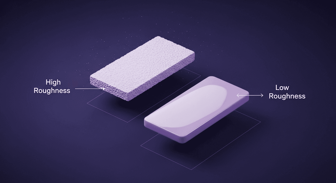
Imagine two spheres. One is a perfect chrome ball, a mirror. Light hits it and bounces off in a single, predictable direction. You see a clear, sharp reflection of the world around it. This surface has a roughness value of 0.
Now, imagine the second sphere is made of unglazed, dry clay. Light hits it and scatters in a million different directions. The reflection is so blurry and spread out that it just looks like a soft, even highlight. This surface has a roughness value of 1.
Every material in the world exists somewhere on this spectrum. A polished wooden floor, a brushed aluminum panel, a smudged phone screen, their character comes from how they play with light. The roughness map is your tool to control that character with pixel-level precision.
Why roughness is a cornerstone of physically based rendering light simulation
So, why is this so critical for PBR? Because PBR isn’t about faking it. It’s about simulating how light actually works. In the real world, no surface is perfectly smooth or perfectly rough. The magic of physically based rendering light simulation is that it respects a core law of physics: the conservation of energy.
Here’s what that means: the total amount of light that hits a surface must be reflected. It can’t just disappear. A roughness map dictates how that light energy is distributed.
- Low roughness (shiny): The light is concentrated into a small, bright, focused highlight (a specular reflection).
- High roughness (matte): The same amount of light energy is scattered over a much wider area, making the highlight appear larger, dimmer, and softer.
Getting this right is the difference between an object that looks like it belongs in your scene and one that looks like a cheap plastic toy. It’s the foundation of realistic surface reflectivity control.
How roughness maps control light reflection
Alright, so we know what it does, but how does the engine know how to read that black-and-white map? It’s not just an artistic suggestion; it’s a direct instruction based on some pretty cool physics.
A look at the physics: Microfacets and how they scatter light
Think of any surface, no matter how smooth it looks, as being made of countless microscopic planes. These are called microfacets. You can imagine them as tiny, tiny mirrors all over the surface of your model.
- On a smooth surface (like polished chrome), all these microscopic mirrors are aligned, pointing in the same direction. When light rays hit them, they all bounce off together in a coherent, mirror-like reflection.
- On a rough surface (like concrete), these microfacets are angled chaotically. When light rays hit them, each one bounces off in a slightly different direction. The result is a diffuse, scattered reflection.
Your roughness map is essentially a set of instructions telling the render engine how jumbled up those microfacets are at any given point on the surface. It’s an incredibly efficient way to simulate a complex physical phenomenon without modeling billions of tiny planes.
What the 0 to 1 value actually represents in material shading models
The grayscale value in your roughness map from 0.0 (black) to 1.0 (white) is a direct input for the material’s Bidirectional Reflectance Distribution Function (BRDF). That sounds complicated, but the concept is straightforward.
- A value of 0 tells the shader: All microfacets at this pixel are perfectly aligned. Create a sharp, mirror-like specular highlight.
- A value of 1 tells the shader: The microfacets here are in total chaos. Scatter the light energy as widely as possible, creating a very diffuse highlight.
- A value of 0.5 (mid-gray) says: There’s some variation in the microfacet angles. Create a semi-blurry highlight, somewhere between a mirror and a piece of chalk.
This is why subtle gray values are your best friend. The smudges on a glass table aren’t pure white; they’re subtle variations in gray that break up the perfect reflection. The scuffs on a metal plate aren’t just scratches in the normal map; they’re shifts in roughness that change how light glints off the surface. This is the core of modern material shading models.
From theory to texture: A technical guide to controlling light in PBR
You get the science. Now, let’s make it work for you. Building a great roughness map is less about technical wizardry and more about keen observation and deliberate choices. Here are some best practices for your day-to-day workflow.
Best practices for creating accurate roughness maps in your workflow
Your goal is to create variation that tells a story. A pristine, uniform roughness value is almost always a sign of a CG object. Reality is messy.
Tips for Substance Painter and Blender:
- Start with a base value: Don’t start with pure black or white. Establish a base roughness that defines the core material. Is it plastic (0.4-0.6)? Is it lacquered wood (0.2)? Start there.
- Layer, don't just paint: Use procedural textures, grunge maps, and generators as your foundation. In Substance Painter, stack Fill layers with masks generated from curvature, ambient occlusion, and world-space normals. This automatically places wear and grime where they would naturally occur.
- Break it up with grunge: Use a subtle, large-scale grunge map with very low opacity (like 5-10%) over the entire surface. This adds subtle, low-frequency variations that break up the perfectly clean look.
- Hand-paint for story: This is where you, the artist, come in. Add specific details. Where would hands have touched this object, leaving smudges? Where would water have pooled and dried, leaving mineral deposits? Use a paintbrush with a soft alpha to add these storytelling elements.
Reading real-world reference materials:
This is non-negotiable. Stop looking at other people’s art and start looking at the real world. Go pick up a metal tool. Notice how the handle is smoother and shinier from wear, while the recessed areas are duller with grime. Look at a car door. The edges are often more scuffed (rougher), and the flat planes are covered in a fine layer of dust (also rougher) that gets wiped away in streaks. Train your eye to see roughness, not just color.
Avoiding common pitfalls: From plastic-looking metals to inconsistent surfaces
It’s easy to get this wrong. Here are the most common mistakes and how to fix them:
- The plastic metal problem: This happens when your metallic value is 1, but your roughness value is too high and uniform. All metals have a very low roughness value at their base. Brushed metal is just a series of fine, anisotropic scratches on top of a very reflective base. Fix it by lowering your base roughness and using a detailed grunge or procedural map to add surface imperfections.
- The perfectly uniform surface: Nothing is ever one single roughness value. Even a brand-new object has microscopic variations. A painted wall isn't uniformly matte; the texture of the paint creates tiny peaks and valleys with slightly different roughness values. Always add a layer of subtle, low-contrast noise or grunge.
- Ignoring material logic: Don't just slap a random grunge map on everything. Think about the material. Wood grain has different roughness values for the early and late wood. A worn leather chair will be shinier on the seat and armrests. Let the object’s function and history dictate your roughness map.
Leveling up: Optimizing for performance and final polish
Mastering roughness isn’t just about making a single asset look good in a close-up render. It’s about making entire scenes that are both beautiful and performant. This is where you separate the pros from the hobbyists.
How roughness maps define material appearance in 3D rendering beyond the basics
A great roughness map adds a layer of narrative depth that subconsciously sells the reality of the scene. Think about a puddle on an asphalt road. The water itself is smooth (low roughness), creating a sharp reflection of the sky. The wet asphalt surrounding it is darker and has slightly lower roughness than the dry parts, but it isn’t a perfect mirror. The dry asphalt is very rough, with almost no clear reflection.
In one texture, you’ve told a story about weather, time, and material interaction. This is how roughness maps define material appearance in 3D rendering: they provide context and history, making the environment feel lived-in and dynamic.
The balancing act: Optimizing map resolution and values for game engines like Unity
In games, every texture lookup costs performance. A 4K roughness map for a tiny prop is a waste of memory and processing power. Here’s how to be smart about it:
- Resolution vs. Detail: High-frequency details (like tiny scratches) need higher resolution maps. Low-frequency details (like large, soft smudges) can be stored in a much lower-resolution map. For many assets, you can get away with a 1K or even 512px roughness map if the variations are large and soft.
- Channel packing: This is your best friend. Never ship a grayscale roughness map as its own texture file. It’s a waste of three channels (R, G, and B). Instead, pack it into the alpha channel of your metallic map or another texture. This is standard practice for ARM (Ambient Occlusion, Roughness, Metallic) texture packing, saving huge amounts of memory.
- MIP mapping and blurriness: Game engines use MIP maps (lower-resolution versions of textures) for objects far from the camera. A very noisy, high-frequency roughness map will blur into a flat gray at a distance, losing all its detail. Sometimes, a simpler roughness map with strong, clear shapes holds up better from afar.
Tying it all together: How roughness interacts with metallic and normal maps
Your textures are a team. They have to work together. A roughness map on its own is powerful, but its true potential is unlocked when it complements your other maps.
- Roughness + Metallic: This duo defines the material type. A surface is either a metal or a non-metal (dielectric). For metals (metallic = 1), roughness controls whether it’s a mirror (low roughness) or sand-blasted aluminum (high roughness). For dielectrics (metallic = 0), roughness determines if it’s wet (low roughness) or dusty (high roughness).
- Roughness + Normal: The normal map creates the large-scale surface details the bumps, dents, and cracks. The roughness map handles the micro-surface details, the polish, wear, and grime on top of those bumps. A deep crack in a rock (normal map) should have a different roughness value (e.g., collecting dust, making it rougher) than the exposed, polished surface. When these two maps tell a consistent story, the material becomes believable.
It's more than a map, it's your signature
That feeling that a material is close, but just not quite there. By now, you see the secret isn't in your color map or your model, it’s in the light. And more importantly, how you choose to control it.
We've unpacked the physics of microfacets and the pipeline tricks of channel packing, but the biggest takeaway isn't technical. It's this: your roughness map is the final word on realism. It's the history of an object written in smudges, scuffs, and polish. It’s the detail that turns a good model into a believable asset that belongs in its world.
You now have the insight to move beyond just plugging in generic grunge maps. You can look at a piece of reference, a worn leather chair, a rain-streaked window, a scuffed metal tool, and understand the why behind its appearance. That's the difference between following a tutorial and making a deliberate, artistic choice.
So the next time you open up your project, don't just see a grayscale channel. See a story waiting to be told. You’ve got the tools. Now go tell it with light.

Max Calder
Max Calder is a creative technologist at Texturly. He specializes in material workflows, lighting, and rendering, but what drives him is enhancing creative workflows using technology. Whether he's writing about shader logic or exploring the art behind great textures, Max brings a thoughtful, hands-on perspective shaped by years in the industry. His favorite kind of learning? Collaborative, curious, and always rooted in real-world projects.
Latest Blogs

A Practical Guide for How to Choose The Right Concrete Texture fo...
3D textures
PBR textures

Mira Kapoor
Apr 29, 2026

VR Textures in Unreal Engine: A Beginner’s Guide to Setup, Optimi...
3D textures
AI in 3D design

Max Calder
Apr 27, 2026

360 Environment Textures vs Traditional Textures: Key Differences...
AI in 3D design
PBR mapping

Max Calder
Apr 24, 2026
