Stop Decorating: How to Use Texture in Product Design to Communicate Value
By Max Calder | 21 August 2025 | 11 mins read
Table of contents
Table of Contents
You’ve nailed the bodywork. The reflections are perfect, the panel gaps are tight enough to make an engineer weep. So why does that million-dollar interior still look like cheap plastic in your render? It’s because texture isn’t just a map you apply; it’s the silent language of physical objects. This guide isn’t about the PBR basics you mastered years ago. We’re going to unpack the specific principles and advanced techniques you need to translate the feeling of a material from the cool grain of open-pore wood to the precise grip of a knurled dial directly through the screen. Because in your world, a render is never just a picture. It’s the final stop before a multi-million dollar decision, and your job is to make stakeholders not just see the design, but feel it.

Beyond the surface: From decoration to communication
You’ve mastered the art of the hero shot, but a truly great render is more than just a beautiful image. It’s a communication tool. Before we dive into the specific techniques, we need to shift our mindset. Texture isn't a final detail you apply to a surface; it's a foundational element that speaks volumes. This section is about understanding the role of texture as a silent narrator of a product's story and how you can leverage it to convey value, function, and brand identity.
Understanding the role of texture in product design
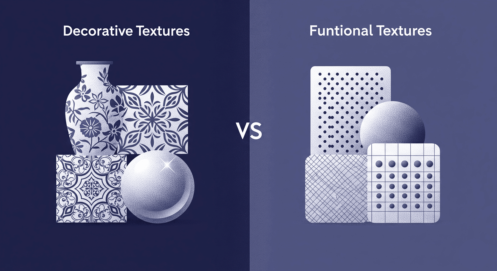
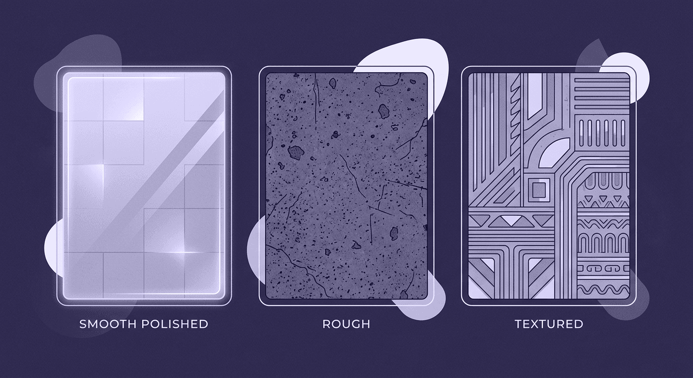
There are two kinds of texture we’re dealing with. Visual texture is what you create in a render, the illusion of a surface. Tactile texture is the physical feel of that surface. As a visualization artist, your job is to use visual texture so effectively that it perfectly implies the tactile experience. A glossy plastic surface in your render communicates a hard, smooth feel, while a matte, soft-touch finish suggests something more yielding and premium. You aren’t just showing what a product looks like; you're telling the viewer what it would feel like to hold and use. When you stop seeing texture as a final layer and start treating it as a communicative device, you change the game.
Now that we’ve defined our terms, let’s unpack how these textures fundamentally shape a product’s story.
How texture impacts product perception and builds identity
Texture is a silent narrator. It builds a product’s character and can instantly make it feel premium, rugged, intuitive, or cheap. The right texture telegraphs value faster than any logo or price tag.
Think about the interior of a modern car. The dashboard in a base model might be a hard, high-gloss plastic with a simple molded grain. It’s durable, easy to clean, and cost-effective. Your render of that surface communicates utility. Now, imagine the dashboard in the luxury trim. It might be a soft-touch, low-sheen material that absorbs light, with a texture that mimics stitched leather. Even if both are technically just polymers, the textural experience is worlds apart. One feels engineered for a budget; the other feels crafted for comfort.
In a design review, you’re not just presenting geometry. You’re communicating the intended user experience. A knurled aluminum dial feels precise and technical. A smooth, bead-blasted button feels modern and minimalist. Your ability to realistically render these surfaces allows stakeholders to feel the design intent, making your work a critical part of the decision-making process. This is how you move beyond just creating visuals and start shaping the product itself.
The strategic playbook: Using texture to tell a story
Now that we’ve established texture as a powerful communication tool, let's talk strategy. This isn't about random application; it's about making deliberate choices to build a narrative. The textures you select can silently communicate a product's quality, enhance its function, and solidify a brand’s identity. This section breaks down the three core pillars of this strategic playbook, showing you how to turn your technical skills into a powerful design language.
Communicate quality and value through material choice
Specific textures are universally understood shorthand for quality. They are part of a shared design language that you can leverage to tell a powerful story about a product’s value. Your material choices are your primary vocabulary.
Brushed aluminum, for instance, doesn’t just look metallic; it communicates precision, lightness, and durability. It’s a texture associated with high-end electronics and performance vehicles. A matte black finish feels modern, sophisticated, and a little stealthy. Natural wood grains, even when simulated, bring warmth and a sense of organic craftsmanship into a cold, technical space. In automotive visualization, this is your bread and butter. The material choices in a car’s cockpit define its entire character. Is the trim a standard, injection-molded plastic, or a hand-laid carbon fiber with a deep, satin finish? One says reliable commuter, the other screams performance machine. You tell that story with your textures long before anyone reads a spec sheet.
Enhance function and usability with tactile design elements
Great design isn’t just about looking good; it's about working well. Texture is often the bridge between aesthetics and function, guiding the user’s interaction with an object. These are textures that serve a purpose.
Take the knurling on a watch crown or a volume dial. That rough, cross-hatched pattern isn’t just for show; it provides grip, making it easier to turn. The texture itself sends a clear message: Interact with me here. Similarly, a rubberized, stippled texture on a power tool handle says, Hold here for a secure grip. A subtle, concave depression on a button invites a finger to press it. Even in a purely visual medium like a render, these functional textures are non-negotiable. Your render of a climate control knob needs to look grippable. The viewer’s brain should immediately understand its function simply by processing the visual cues of its surface. You’re simulating usability.
Create a unique design sensory experience for your brand
When used consistently, texture becomes a core part of a brand’s identity. It’s a signature that makes a product line feel cohesive and instantly recognizable. Think about the brands you know, chances are, you can recall their textural language.
Apple has practically owned the look and feel of bead-blasted and anodized aluminum. It’s clean, cool to the touch, and minimalist. Google’s Nest products often use soft, heathered fabrics, making their technology feel warm, approachable, and part of the home. In the automotive world, this is even more pronounced. When you’re tasked with visualizing a new model for a brand like Audi or Volvo, you’re working with a meticulously curated library of materials. That’s not a creative limitation; it’s their brand language, expressed through texture. Your job is to translate that language with perfect fidelity, reinforcing the brand’s identity in every single render.
Core techniques for creating meaningful product textures
You’ve established the mindset: texture is a communicative device, not just a decorative layer. This section moves from theory to practice, breaking down the specific techniques you need to make your textures not just look real, but feel authentic to anyone who sees your render. We'll cover everything from replicating real-world materials to leveraging the power of procedural generation.
Layering imperfections for hyper-realism
Here’s a hard truth: Perfection is the enemy of realism. A perfectly clean, uniform, and flawless surface immediately screams CGI. Real-world objects have a history, and that history is written on their surfaces in the form of subtle imperfections.
This is where you graduate from being a renderer to being a storyteller. Instead of applying one clean texture map, think in layers. A high-gloss plastic panel in a car will have micro-scratches from cleaning, faint fingerprints near the edges, and a thin layer of dust settled in the seams. A leather seat will have subtle color variations, minor wrinkles from use, and slightly more sheen on the areas that see the most contact. Each imperfection tells a story of how the object is used and how it exists in the world. The key is subtlety. Use grunge maps, composite shaders, and procedural masks to add this detail—don’t overdo it. You’re aiming for believability, not a post-apocalyptic mess.
Leveraging procedural generation for complex surfaces
Tiled, repeating textures are a dead giveaway. They break the illusion instantly, especially on large surfaces. This is where procedural generation becomes your most powerful tool. Using nodes and algorithms in tools like 3ds Max or Substance Designer allows you to create infinitely variable, non-repeating surfaces.
This technique is essential for complex, modern materials. You know how distracting a tiled carbon fiber weave looks on a car hood render? A procedural approach allows you to create the core pattern and then use noise and fractal functions to introduce the subtle, organic variations found in a real composite layup. The same goes for Alcantara, forged composites, or even the random porousness of cast metal. Procedurals break the uniformity and sell the realism at a level that a simple bitmap texture never can.
How to effectively use texture in industrial design from real-world references
Your greatest texture library isn’t on a hard drive; it’s the world around you. You need to stop just looking at objects and start studying them. Build your own reference library, and your phone is the only tool you need to start.
Go to a car dealership. Visit a high-end electronics store. Take close-up photos of dashboard materials, brushed metal knobs, speaker grilles, and seat fabrics. Pay attention to how light interacts with each surface. How sharp is the reflection on that chrome trim? How diffused is the highlight on that soft-touch plastic? Is the bump on that leather deep or shallow? Deconstruct what you see. Every material can be broken down into its core PBR components: base color, roughness, metalness, and normal/bump. Analyzing how light and shadow play across a real object is the fastest way to understand how to build it digitally. Your real-world observation is the ground truth for your digital work.
The workflow: Bringing texture to life in 3D visualization
You’ve mastered the art of observation, and you’ve developed a strategic mindset. Now, let’s get into the how. The most brilliant texture concept is useless without a flawless execution in your 3D software. This section moves from theory to practice, breaking down the specific steps you need to take in your workflow to make these textures not just look real, but feel authentic to anyone who sees your render. We’ll cover everything from material setup to the crucial role of lighting.
Setting up advanced materials in VRED or 3ds Max
A killer texture is useless if the material setup is basic. Stop just plugging maps into their corresponding slots and calling it a day. The real art is in the layering.
In VRED, use the layered material. In 3ds Max with V-Ray, use a BlendMtl. The principle is the same: start with a base material that defines the core surface, then layer other materials on top using masks. For a car’s center console, your base might be black plastic. On top of that, you’d layer a slightly glossier material for fingerprints, masked with a subtle grunge map. Then, add a clear coat layer with its own set of fine scratches and smudges controlled by a different mask. The relationship between your maps is everything. A detailed roughness map with subtle variations will do more for realism than a 16K diffuse map ever could. This is how you create a design sensory experience that feels deep and authentic.
Lighting your scene to highlight product surface design
Bad lighting will murder a perfect material. It’s that simple. Your lighting setup needs to be designed to reveal and enhance the textures you’ve so carefully built, turning a good render into a photorealistic one.
A single, soft, diffuse studio light might be great for showing off the overall form of a product, but it can flatten out all the subtle surface details you’ve worked so hard on. The trick is to use multiple lights with different purposes. Use a large HDRI for realistic ambient light and reflections, but then add a smaller, more intense key light positioned at a low, raking angle. This sharp light will scrape across the surfaces, catching the peaks of your normal maps and revealing the fine grain of a leather texture or the crisp edges of a knurled dial. Play with light positioning; watch how a slight change in angle can completely transform how a product's surface design is perceived.
Balancing micro and macro texture details
Finally, for a render to hold up under scrutiny, especially in high-stakes design reviews, you have to nail both the micro and macro levels of detail.
Micro-details are the fine-grain surface qualities. Think of the tiny pores in leather, the subtle anisotropic pattern in brushed metal, or the weave of a fabric. These are typically handled by your high-frequency normal and roughness maps. They are what make a material convincing in a close-up shot.
Macro-details are the larger-scale variations across the surface. These are the wrinkles and creases in a leather seat as it wraps around a cushion, the subtle warping or oil canning on a large metal panel, or the seams and stitching that define a product's construction. These details are often modeled or sculpted, but can also be achieved with displacement or broader normal maps.
You need both. Micro-details sell the authenticity of the material itself, while macro-details sell the authenticity of the object as a whole. Mastering the balance between them ensures your work is flawless, whether it’s a wide shot of a full car or a super-detailed shot of the stitching on a gear shifter. This is how you stop decorating surfaces and start truly communicating design.
It's more than just a surface
You're not just texturing a model anymore. You're the person in the room who translates the feeling of a product into something everyone can see and understand. Every choice from the subtle grain on a piece of plastic to the micro-scratches on a clear coat is a part of the story.
The next time you build out a material for a dashboard or a dial, remember that you're crafting the silent narrator of the design. It’s the difference between a render that shows what a product looks like and one that communicates how it's meant to be experienced. This is how your work moves from being a beautiful image to being a critical piece of the decision-making process.
Your work isn’t the final coat of paint; it’s the conversation starter. You’ve got the eye and the tools. Go tell the full story.

Max Calder
Max Calder is a creative technologist at Texturly. He specializes in material workflows, lighting, and rendering, but what drives him is enhancing creative workflows using technology. Whether he's writing about shader logic or exploring the art behind great textures, Max brings a thoughtful, hands-on perspective shaped by years in the industry. His favorite kind of learning? Collaborative, curious, and always rooted in real-world projects.
Latest Blogs

A Practical Guide for How to Choose The Right Concrete Texture fo...
3D textures
PBR textures

Mira Kapoor
Apr 29, 2026

VR Textures in Unreal Engine: A Beginner’s Guide to Setup, Optimi...
3D textures
AI in 3D design

Max Calder
Apr 27, 2026

360 Environment Textures vs Traditional Textures: Key Differences...
AI in 3D design
PBR mapping

Max Calder
Apr 24, 2026
