From Flat to Photoreal: Guide to Seamless Fabric Texture Design
By Max Calder | 12 September 2025 | 13 mins read
Table of contents
Table of Contents
Wrestling with a repeating fabric texture to get it just right is one of the least glamorous parts of 3D apparel design. We've all been there: you spend hours nailing the perfect garment, only for it to be let down by a texture that looks flat, fake, or has a seam you can spot from a mile away. This guide is here to fix that. We're going to walk through the complete, no-nonsense workflow for creating stunning, seamless fabric textures that look and feel real. This isn't just about learning one filter in Photoshop; it's about building a smarter process that elevates the quality of your renders and, more importantly, gives you back valuable time to actually design.
Lay the groundwork: What makes a fabric texture convincing?
You can spot a bad digital fabric from a mile away. It looks flat, fake, and plasticy. The reason? The artist skipped the fundamentals. Before you even open Photoshop, understanding the physical nature of fabric is what separates amateur work from professional results. It’s not just about a repeating pattern; it’s about recreating a material that has structure, history, and a story to tell.
Deconstruct the weave: Understanding fabric structure before you start
Think of this as the anatomy lesson for your digital fabrics. Every textile is built in a specific way, and that construction dictates how it looks, drapes, and reacts to light. Get this right, and you’re 90% of the way there.
- Wovens vs. Knits vs. Non-Wovens: This is the big three. A woven fabric, like denim or linen, is a simple grid of interlocking threads (warp and weft). This structure creates a stable, often rigid material with a subtle grid-like pattern. Knits, like a t-shirt or a sweater, are made from a single, continuous thread looped around itself. This gives them their characteristic stretch and a V-shaped pattern. Non-wovens, like felt or leather, aren’t made of threads at all; they're matted or bonded fibers.
Why does this matter? Because a knit texture mapped like a woven will instantly look wrong. The thread direction, scale, and the tiny shadows cast by the weave are the details that sell the illusion. Before you start designing, zoom in on a real-world reference. See how the threads catch the light. That’s your target.
Choose your source: The pros and cons of photo vs. procedural textures
Next, you need your raw material. You have two main paths, and neither is universally better; they’re just different tools for different jobs.
- When to use photos: Got a unique, one-of-a-kind fabric? A vintage floral print, a specific worn leather, or a hand-dyed silk? A high-resolution photo is your best friend. Photos capture the organic chaos and subtle imperfections that are incredibly difficult to generate from scratch. The tradeoff is control. What you shoot is what you get, and it can be time-consuming to make them tile perfectly.
- When to use procedural tools: Need a texture you can tweak endlessly? This is where procedural tools like Adobe Substance Designer shine. You can build a fabric from the thread up, adjusting the weave pattern, color, roughness, and even adding procedural wrinkles or damage on the fly. This workflow is perfect for creating versatile materials for large projects, like a base cotton that can be turned into 100 different colorways. It’s a bigger upfront investment in learning, but the payoff in flexibility is huge.
Ultimately, the best workflow often uses both. You might use a photo for the base color and then generate procedural maps in Substance to control the roughness and normals. The key is knowing what you need to achieve and choosing the path that gets you there fastest. Now, let’s get our hands dirty and build one.
The core workflow: Building your seamless fabric texture
Alright, theory’s over. This is where we actually make something. The goal here is simple: create a base texture that can repeat infinitely without any visible seams. This is the bedrock of any good seamless fabric texture design. Get this part wrong, and nothing else you do will fix it.
Capture and clean your source material
If you’re going the photo route, your final texture is only as good as your initial shot. You don't need a professional photo studio, but you do need to control your environment.
- Lighting is everything. Avoid harsh, direct light at all costs. It creates deep shadows and bright highlights that are a nightmare to remove and will look baked into your final texture. Shoot on an overcast day near a window, or use a simple softbox. The goal is flat, even, and diffuse light.
- Get it flat and square. Lay your fabric on a flat surface and shoot directly down from above. Any angle will cause perspective distortion that you’ll have to fight with later. Use a tripod if you can.
Once you have your shot, it’s time for a quick cleanup in a tool like Photoshop or Affinity Photo. Don’t go crazy here, just the essentials. Correct any lens distortion, use a Levels or Curves adjustment to even out any remaining light inconsistencies, and use the Spot Healing Brush to zap any obvious lint, dust, or blemishes. You want a clean, neutral canvas to work from.
Create a tileable texture using the offset filter
This is the classic, battle-tested technique, and it works every time. The Offset filter is your secret weapon for finding and destroying seams.
- Crop to a square: Start by cropping your cleaned image to a square selection that captures a good, representative area of the fabric. The exact size depends on the resolution you need, but 2048x2048 or 4096x4096 pixels is a great starting point.
- Run the offset filter: Go to Filter > Other > Offset. Enter values that are exactly half of your image’s dimensions. For a 2048x2048 image, you’d enter +1024 for both Horizontal and Vertical. Make sure “Wrap Around” is selected.
- Reveal the seams: Your image will now have a cross-shaped seam running through the middle. This is where the edges of your original image now meet. This is what you need to fix.
- Blend, blend, blend: This is the artistic part. Use the Clone Stamp tool to fix any hard, obvious breaks in the weave or pattern. Hold Alt/Option to sample a clean area, and paint over the seam to restore the pattern. Then, use the Healing Brush or Patch Tool to blend the tones and textures more organically. Take your time. Zoom in and out frequently to check your work.
- Test it: Run the Offset filter again with the same settings. If you’ve done your job right, the seams should be gone. You can also define the image as a pattern (Edit > Define Pattern) and fill a larger canvas to check for any obvious repeating elements.
The result? A perfectly repeating base texture. This is your color map (also called an Albedo map), and it’s the foundation for adding true-to-life dimension.
Master advanced digital fabric texture techniques
Having a seamless color map is a great start, but it’s just that a start. To trick the eye into believing your digital fabric is real, you need to tell the 3D software how the surface should behave. This is done with a series of grayscale maps that control everything from light reflection to surface detail. This is where we dive into 3D texture mapping for textiles.
Generate essential maps for 3D realism
These maps are non-negotiable for realistic fabric texture creation. Most modern 3D tools, especially apparel-focused software like CLO3D, rely on them to render materials correctly.
- Normal map: This is the most important map for fabric. It fakes the fine details of the weave without adding any extra geometry to your model. It tells the rendering engine where the tiny bumps, threads, and imperfections are, allowing light to interact with them realistically. You can generate a good Normal map from your color texture using Photoshop’s old NVIDIA plugin, a dedicated tool like Texturly.
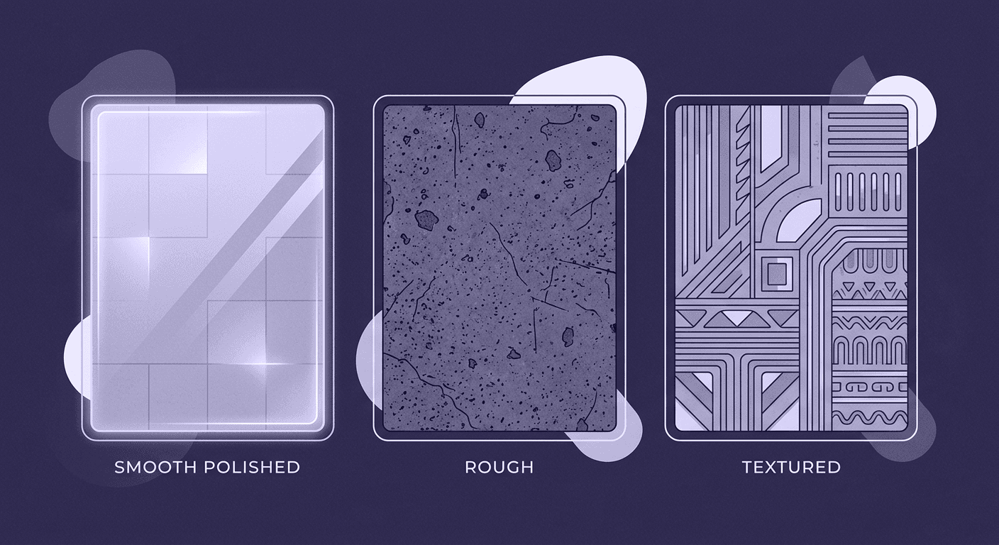
- Roughness map: This map controls how light scatters across the surface. A pure white value is completely rough (like felt), while a pure black value is perfectly smooth (like polished plastic). For fabric, you’ll almost always be in the grayscale range. Silk will be darker (smoother), while cotton will be lighter (rougher). A good roughness map will have subtle variations to show how different parts of the weave catch the light.
- Displacement/Height map: While a Normal map fakes detail, a Displacement map actually pushes and pulls the 3D mesh. This is great for chunkier fabrics like heavy knits or embroidered details, where you want the silhouette to be physically affected. Use it sparingly, as it’s computationally expensive, but for the right material, it adds that final layer of depth.
Add subtle imperfections for a believable finish
Here’s the secret that separates good textures from photorealistic ones: perfection is fake. Real fabric has flaws. It’s been worn, washed, and exposed to the world. Your digital textures should reflect that.
This is a crucial step in advanced digital fabric texture techniques. Once your main maps are done, go back and add tiny, almost invisible details. A few ideas:
- Add a single stray thread or a bit of pilling to the color and normal map.
- Introduce subtle color variations to the base color, as if the dye isn't perfectly uniform.
- Lightly paint in some soft, barely-there crease lines or wear marks on the roughness map.
These details should be so subtle that you don't notice them individually. But together, they break the digital uniformity and sell the material’s story. It’s the difference between a fabric that looks like it came from a factory and one that looks like it belongs in the real world.
Test and validate your texture across different lighting conditions
Finally, you need to see how your texture holds up in a real 3D environment. A texture can look great as a flat square in Photoshop, but fall apart on a curved surface or under different lighting.
Open up CLO3D, Marmoset Toolbag, or even Blender and apply your material to a simple object like a sphere or a draped plane. Rotate the object and the lights. Look for:
- Obvious tiling: Does a specific dark spot or flaw repeat in a distracting, grid-like pattern? If so, go back and blend it out.
- Map intensity: Is the Normal map too strong, making the fabric look like sandpaper? Is the Roughness map making it look too wet or too dry? Tweak the intensity of your maps until they feel right.
This final check is your quality control. It ensures your hard work pays off and that your texture will look fantastic in any scene.
Streamline your process: Professional tips and tricks
Creating a single great texture is one thing. Building an efficient, professional workflow is another. The goal is to work smarter, not harder, so you can spend more time on the creative parts of your design. This means getting organized, knowing how to fix common problems, and using the right tool for the job.
Build a reusable digital textile design library
Don’t let your finished textures die in a random project folder. Every texture you create is an asset you can reuse, tweak, and build upon. A well-organized library is one of the most valuable things a 3D designer can have.
- Establish a folder structure: Create a master folder for your textures, then subdivide it logically. A good approach is Fabric Type > Weave/Pattern > Material Name. For example: Wovens > Denim > Worn_Blue_Twill.
- Use a clear naming convention: This is a lifesaver. Name every file with the material name followed by the map type. For example:
- Worn_Blue_Twill_Albedo.png
- Worn_Blue_Twill_Normal.png
- Worn_Blue_Twill_Roughness.png
This system takes seconds to set up, but it will save you hours of searching for files down the line. When a client asks for a simple cotton twill, you’ll have it ready to go in minutes.
Troubleshoot common fabric rendering techniques and issues
Even with a perfect texture, things can go wrong when you apply it to a 3D model. Here are two of the most common problems and how to fix them.
- Problem: The texture looks stretched or distorted. This is almost always a UV mapping issue. Think of UVs as the flat paper pattern for your 3D garment. If the pattern piece is stretched in one direction, the fabric texture applied to it will also stretch. In CLO3D or a similar program, use the UV Editor to check your pattern pieces. Make sure they are laid out flat and aren't distorted. Adjust them until the texture grain flows correctly across the garment.
- Problem: The pattern scale is wrong. Your plaid looks like a giant grid, or your tiny floral print is a blurry mess. This is a simple tiling issue. In your 3D software’s material editor, you’ll find controls to adjust the texture’s scale or tiling (sometimes called UV transformations). Adjust these values up or down until the fabric pattern is the correct real-world size for your garment.
Know when to use different software for the job
As you advance, you’ll realize that a single piece of software can’t do everything perfectly. The most efficient professionals use a combination of tools, leveraging each for its strengths.
- Use Photoshop (or Affinity Photo) for: Photo-based workflows. When you need to clean up a scan, make a photo tileable using the Offset method, or make artistic, hand-painted adjustments, a raster editor is your go-to.
- Use a tool like Substance Designer for: Procedural power and complexity. When you need to design a complex pattern like a jacquard, a delicate lace, or a fabric with lots of customizable parameters, Substance Designer is the industry standard. It gives you unparalleled control to build materials from the ground up, making it ideal for creating highly versatile and reusable digital textile design assets.
Mastering these tools and techniques will not only speed up your workflow but also elevate the quality and realism of your final renders, giving you a powerful edge in the world of digital apparel design.
Your texture is the story
So, we’ve walked through the whole process from cleaning up a photo to generating the maps that bring a fabric to life. But the goal was never just to create a texture that doesn’t have a seam. It’s about getting the technical stuff out of the way so you can focus on what really matters.
Because a great texture does more than just cover a 3D model. It tells a story. The subtle scuffs on a roughness map suggest a history. The crispness of a normal map communicates quality and feel. Mastering this workflow isn’t just about efficiency; it’s about having a deeper, more nuanced vocabulary to express your design intent.
Now you have a process you can rely on, a foundation to build your own library, and the confidence to troubleshoot the inevitable hiccups. You’ve turned a tedious chore into a powerful part of your creative toolkit. Go design something that doesn’t just look real, make it feel real.

Max Calder
Max Calder is a creative technologist at Texturly. He specializes in material workflows, lighting, and rendering, but what drives him is enhancing creative workflows using technology. Whether he's writing about shader logic or exploring the art behind great textures, Max brings a thoughtful, hands-on perspective shaped by years in the industry. His favorite kind of learning? Collaborative, curious, and always rooted in real-world projects.
Latest Blogs

A Practical Guide for How to Choose The Right Concrete Texture fo...
3D textures
PBR textures

Mira Kapoor
Apr 29, 2026

VR Textures in Unreal Engine: A Beginner’s Guide to Setup, Optimi...
3D textures
AI in 3D design

Max Calder
Apr 27, 2026

360 Environment Textures vs Traditional Textures: Key Differences...
AI in 3D design
PBR mapping

Max Calder
Apr 24, 2026
