Understanding Textile Textures: Types, Characteristics & Applications
By Mira Kapoor | 10 July 2025 | 14 mins read
Table of contents
Table of Contents
You’ve spent hours perfecting a garment’s fit in CLO3D, the silhouette is flawless, and the color palette is on point. But when you hit render, something just feels… off. Your design looks sterile, like a plastic shell instead of a living piece of apparel. That common frustration almost always comes down to texture. This guide breaks down the essential types of textile textures not just what they look like, but how their physical properties translate to more believable, photorealistic renders. We'll move beyond flat swatches to explore how a fabric's surface is the key to its story, dictating its drape, its structure, and how it interacts with light. It’s the secret to creating digital garments that feel tangible, believable, and ready for a close-up.

Why we obsess over texture: It's more than just a look
Most teams think their textures are just another map to plug in. They’re right, but not in the way they think. Texture isn’t just a visual overlay; it’s the bridge between a flat swatch and a believable 3D render. It communicates the fabric’s history, its weight, and how it will behave in the real world. A flat, unconvincing texture screams digital, while a well-executed one whispers quality and makes the garment feel tangible, even through a screen.
A good texture adds the subtle imperfections and physical cues that our eyes expect to see. It’s the slight pucker of a seam on seersucker, the deep light absorption of velvet, or the crisp, reflective sheen of taffeta. Getting this right is what separates a decent render from one that gets immediate client sign-off. It’s about adding realism, depth, and character that a simple color map can never achieve on its own. It's time we moved beyond flat swatches and started building garments that truly feel alive.
Fabric texture taxonomy: A practical guide to fabric texture varieties
Understanding fabric isn’t about memorizing thousands of individual textiles. It’s about recognizing patterns. Most fabric surfaces fall into one of four main families. Once you know their core characteristics, you can identify, replicate, and design with them far more effectively. Here’s a practical breakdown of the types of textile textures you’ll encounter most often.
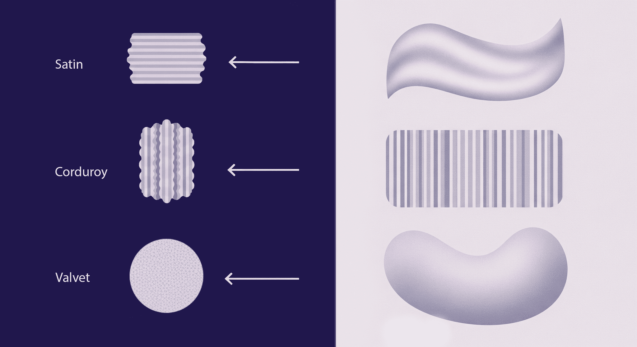
Smooth & sleek textures
Satin, Sateen, Taffeta, Charmeuse.
- Key characteristics: Their defining trait is light reflection. A smooth surface acts like a mirror, creating sharp, often anisotropic highlights that travel across the form. This gives them a characteristic luster or sheen that we associate with formality and luxury. Their drape is often crisp and fluid, falling in clean, conical folds rather than soft, crumpled ones.
- For the 3D designer: The key to replicating smooth textures lies in the Roughness map. To get that signature sheen, you need a very low roughness value (closer to black). For fabrics like satin, where the sheen has a direction, an Anisotropy map is essential to stretch the specular highlights along the weave's direction. Don't mistake smooth for simple. A perfect, flat surface looks fake; add a very subtle, large-scale noise to the normal map to break up the perfection.
Raised & structural textures
Corduroy, Twill (like denim), Piqué, Waffles.
- Key characteristics: Durability is a hallmark. The raised ribs, wales, or honeycomb structures add material thickness and reinforcement, distributing stress and resisting abrasion. They provide structure, holding a garment’s shape rather than collapsing against the body. Visually, they create their own shadows, giving them a depth and tactile quality that’s visible even from a distance.
- For the 3D designer: This family is all about the Normal and Ambient Occlusion (AO) maps. A strong Normal map is non-negotiable; it defines the direction of the twill lines or corduroy wales, telling the light how to bounce off the surface. The AO map is your secret weapon, adding contact shadows into the crevices of the weave. This creates the illusion of depth without the high computational cost of displacement. For corduroy, for instance, the AO map will be darkest between the wales, making the texture pop.
Looped & pile textures
Terry cloth, Velvet, Velveteen, Fleece, Bouclé.
- Key characteristics: Their most obvious trait is softness and light absorption. Unlike smooth textures that reflect light, pile textures trap it. Light rays get lost in the forest of fibers, creating a deep, rich matte appearance with a subtle sheen. They are excellent insulators, trapping air to provide warmth, and in the case of terry cloth, the loops dramatically increase surface area for absorbency.
- For the 3D designer: A simple PBR material won't cut it here. Pile fabrics require shaders that can fake micro-geometry. Look for Sheen or Fuzz settings in your render engine. Sheen adds a soft, backward-scattering highlight around the edges of the object, mimicking the way light catches the tips of the fibers. For velvet, the color of the sheen is often different from the base color. Your Base Color map will be dark, while the Roughness will be high to create a diffuse look. The magic happens entirely in the shader.
Irregular & crinkled textures
Seersucker, Crêpe, Plissé, Slub Linen.
- Key characteristics: The primary benefit is that they hide wrinkles, because the entire surface is already wrinkled. This gives them a relaxed, low-maintenance feel. The irregular surface diffuses light in countless directions, creating a soft, matte finish with no discernible specular highlights. This visual noise adds a huge amount of interest and can make a simple garment feel more sophisticated and effortless.
- For the 3D designer: The power duo here is a busy Roughness map and a subtle Normal map. The roughness map should be a grayscale noise pattern, no clean lines, just organic variation. This will break up any light reflection and prevent the surface from looking like plastic. A gentle, non-directional normal map (like a cellular noise) adds to the rumpled look. These textures are also great at hiding tiling seams in your UVs, as the inherent chaos masks repetition.
Beyond the surface: How textile textures affect fabric performance
A fabric's texture isn't just decoration; it's a functional blueprint that dictates its physical behavior. For a 3D designer, understanding these textile surface characteristics is the key to creating simulations that don't just look right, but behave right. The texture is a visible clue to the fabric's underlying physics.
How texture impacts drape, weight, and structure
- Smooth textures (e.g., Satin): The long, unbroken yarns allow the fabric to glide over itself with little resistance. This results in a fluid, liquid drape that falls into sharp, pointed folds. The fabric has high internal cohesion but low surface friction.
- Structural textures (e.g., Twill): The dense, interlocking weave creates inherent stiffness. It resists bending and folding, which is why a denim jacket holds its shape. In CLO3D, this would correspond to higher values for Bending and Buckling. The texture is a physical reinforcement.
- Crinkled textures (e.g., Crêpe): The chemical or mechanical treatment that creates the crinkles breaks the fabric's internal tension. It introduces slack at a micro-level, making the fabric incredibly supple and fluid. It has very little memory and falls softly, creating many small, gentle folds.
When you choose a fabric preset in a simulation program, you're not just choosing a look, you're choosing a set of physical rules. The texture is the visual evidence of those rules in action.
The relationship between texture and durability
A tight, raised weave like twill features closely packed, interwoven yarns. There are very few opportunities for an external object to catch on a single thread. Stress is distributed evenly across the entire structure. This makes it highly resistant to abrasion and tearing.
Conversely, a fabric with long floats (like satin) or loops (bouclé) presents opportunities for snagging. A single pulled thread can create a visible line or pucker across the smooth surface. Pile fabrics like velvet have their own vulnerability: the pile can be crushed or worn away in high-friction areas, creating bald spots. This is why you rarely see velvet used for heavy-duty upholstery without being a high-performance blend. The texture directly predicts its failure points.
Light interaction: How texture creates shadow and highlight
- Smooth surfaces (satin/taffeta): These are defined by specular reflection. Light hits the surface and bounces off at a predictable angle, like a mirror. This creates the bright, sharp highlights that define shiny materials. The smoothness ensures the reflection is coherent and clear.
- Pile surfaces (velvet/fleece): These are masters of light absorption and diffusion. When light hits velvet, it doesn't bounce off the surface. It dives into the pile, scattering among the thousands of tiny fibers. Much of it gets trapped, which is why velvet has such a deep, rich color. The light that does escape is scattered in all directions, creating a soft, matte appearance. The sheen we see is light catching the very tips of the fibers at a grazing angle.
- Raised surfaces (pique/corduroy): These create their own shadows. The texture itself has height and depth. Light hits the peaks, and the valleys fall into shadow. This is why a good AO map is so critical, it pre-calculates these tiny shadows, giving the material an inherent sense of three-dimensionality and grit.
Understanding this relationship allows you to diagnose problems in your renders. If your denim looks like plastic, it’s because your roughness is too low, and it’s creating specular reflections. If your velvet looks flat, it’s because your shader isn’t accounting for light absorption and sheen. Texture is the control panel for light.
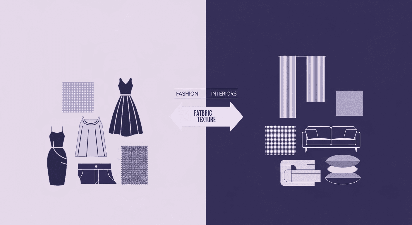
Applying it to work: Textile textures in fashion and design
So you’ve explored texture theory and admired the swatches, but how do you apply them? In fashion and interior design, textures aren’t just decorative; they’re deeply functional. The right textile texture can transform how a garment moves, how a space feels, and how a product performs over time. This section dives into practical, real-world uses of textured fabrics, what works, where, and why.
Which textured fabrics are best for different purposes?
- For structured garments (jackets, trousers, blazers): You need a fabric that can hold its own shape. This is the domain of raised and structural textures. A classic twill (like denim or cavalry twill) provides durable, clean lines. Corduroy offers a softer structure with visual interest and warmth. Pique can be used for more formal or sportswear-inspired jackets, offering breathability and a subtle, sophisticated pattern.
- For flowing & draped garments (dresses, blouses, skirts): Here, you want movement and softness. Irregular and crinkled textures are excellent choices. A crepe de chine offers a beautiful, pebbly surface that drapes fluidly and resists wrinkling. A plisse fabric with permanent, fine pleats creates incredible movement and volume. For a touch of luxury, a silk charmeuse (a smooth texture) provides a liquid-like drape, though it requires more careful handling.
- For everyday basics (t-shirts, loungewear): Comfort is king. While a basic jersey knit is technically a smooth texture, high-quality basics often feature subtle variations. A slub cotton introduces small, irregular thicknesses in the yarn, giving a simple t-shirt a more organic, less mass-produced feel. For warmth and coziness, fleece or terry cloth (looped textures) are the obvious go-tos.
- For upholstery & high-traffic use: This is a balancing act between aesthetics and extreme durability. While a beautiful velvet can look stunning on a sofa, a performance velvet blend is necessary to prevent crushing. Textured weaves like boucle or a heavy-duty herringbone twill are fantastic because their inherent visual noise helps hide minor stains and wear over time. However, be mindful of looped textures like boucle if the client has pets, as they are prone to snagging.
A quick guide: How to identify textile texture characteristics
1. The light test: This is your first and most powerful tool. How does the fabric react to light? Is there a sharp, defined highlight that moves as the fabric turns (Satin)? Is the light completely eaten up, creating a deep, matte look (Velvet)? Or does the surface break the light into thousands of tiny, non-directional points (Crepe)?
2. The shadow test: Look for self-shadowing. Can you see tiny shadows being cast within the fabric's own surface? This is the tell-tale sign of a raised texture. The diagonal lines of a twill or the wales of corduroy will always have a light side and a shadow side, giving them away immediately.
3. The pattern test: Zoom in. Is the texture uniform and geometric, or is it random and organic? A piqué has a repeating diamond or honeycomb pattern. A slub fabric has a random pattern of thick-and-thin lines. This helps you distinguish between man-made structures and organic irregularities.
Tip for building your library: Don't just collect textures, curate them. When you find a fabric you like, whether in real life or online, don't just save a swatch. Create a material ball scene in your 3D software of choice. Apply the texture and study it under different lighting conditions: a single sharp spotlight, a soft area light, and a full HDRi. Name the file with the fabric type and its key characteristics (e.g., Cotton_Twill_Structural_Durable_Matte.sbsar). This practice moves you from being a user of presets to an architect of materials. Your digital library will become a powerful design tool, not just a folder of downloads.
Your texture toolkit is now unlocked
So, go back to that render, the one that was technically perfect but felt completely lifeless. The gap between that flat digital shell and a tangible garment isn’t about finding a better preset. It’s about understanding the why behind the texture.
You now have the framework to deconstruct any fabric you see. Smooth, Raised, Looped, and Irregular aren’t just academic categories; they're lenses for seeing how a textile will bend, catch light, and behave in the real world. This is your new toolkit for diagnosing problems and building materials with intent.
The next time your digital denim looks like plastic, you'll know it's a roughness map problem. When your velvet feels flat, you'll know to tweak the fuzz or sheen shader. This knowledge moves you from simply applying textures to truly designing with them. Your texture library is no longer just a folder of files; it's a palette of physical properties you now know how to control.
Ultimately, a fabric’s texture is its voice. You’ve just learned the language. Now go build garments that have something to say!

Mira Kapoor
Mira leads marketing at Texturly, combining creative intuition with data-savvy strategy. With a background in design and a decade of experience shaping stories for creative tech brands, Mira brings the perfect blend of strategy and soul to every campaign. She believes great marketing isn’t about selling—it’s about sparking curiosity and building community.
Latest Blogs

How Fabric Texture Shapes Design Strategy in Fashion and Interior...
Fabric textures
3D textures

Mira Kapoor
Dec 10, 2025

DIY Textile Texture Techniques That Make Digital Designs Come Ali...
Fabric textures
Texture creation

Max Calder
Dec 8, 2025

Cost vs. Quality: A Decision Framework for PBR Textures
PBR textures
3D textures

Mira Kapoor
Dec 5, 2025
