More Than Texture: The Definitive Guide to Seamless Concrete Walls
By Max Calder | 30 September 2025 | 14 mins read
Table of contents
Table of Contents
We’ve all been there. It’s late, the deadline is closing in, and that perfect concrete texture you spent an hour finding is now repeating so obviously across the wall that it practically screams, “I’m a 3D render!” It’s the kind of frustrating detail that can shatter the entire illusion of photorealism you've worked so hard to build. This guide is about moving past that. We’re going to unpack how to use seamless concrete textures not just as a surface covering, but as a powerful design tool to build genuine atmosphere, depth, and sophistication into your interior scenes. We'll cover both the practical techniques to save you time and the artistic insights to help you turn a simple wall into the anchor of your entire design.

Beyond the basics: What makes a concrete texture convincing?
Most artists think the secret to photorealism is a high-resolution texture map. They’re right, just not in the way they think. A 16K texture of a concrete wall can still look flat, fake, and uninspired if it’s missing the one thing that truly sells the image: subtlety.
Moving past flat surfaces: The role of seamless concrete wall textures in photorealism
Think about a real, concrete wall. It’s not just a single color with some noise layered on top. It’s a canvas of imperfections. There are tiny air bubbles, subtle color shifts from the curing process, and micro-cracks that catch the light in unpredictable ways. This is where most generic textures fail. They give you the idea of concrete, but not the feeling.
Here’s what we’ve found: convincing realism comes from the details that are almost invisible. A slight variation in the roughness map, a faint water stain in the diffuse channel, a barely perceptible shift in height, these are the elements that trick the brain into believing what it sees. This is the core job of high-quality seamless concrete wall textures. They provide a foundation of believable detail that you can build upon.
The biggest enemy of this realism? The dreaded tiling repetition. It shatters the illusion instantly. Seamless textures are the first line of defense. They’re engineered to eliminate obvious seams, allowing you to cover vast surfaces without distracting artifacts. This saves you hours of cloning and patching in post-production, which is critical when you're up against a tight deadline.
But a truly great seamless texture does more. It provides a non-directional, organic pattern that feels random and natural, just like the real thing. It’s the difference between a cheap-looking print and an authentic architectural finish.
Are concrete walls good for interior design? Unpacking the aesthetic appeal
Let’s get this question out of the way: are concrete walls just for unfinished basements and brutalist monoliths? Absolutely not. In fact, they are one of the most versatile tools in modern design.
The magic of concrete lies in its dual personality. It can be raw and industrial, evoking a sense of strength and permanence. But it can also be incredibly refined and elegant. A polished concrete surface can feel as luxurious as marble, while a board-formed wall adds a layer of handcrafted texture that feels both rustic and modern. This balance between the raw and the refined is what makes it so compelling.
More importantly, concrete serves as a powerful neutral backdrop. Think of it like the perfect primer for your design canvas. Its muted, earthy tones allow other materials and colors to stand out. A rich walnut credenza, a plush velvet sofa, or a vibrant piece of art doesn’t have to compete with a concrete wall; it’s enhanced by it. The wall becomes a quiet, confident anchor for the entire space, adding depth and character without overwhelming the scene. It’s a statement piece that doesn’t shout.
For an artist, this is a huge advantage. You can use exposed concrete surfaces to create a sophisticated, high-end feel that clients love, moving beyond predictable painted walls and into the realm of bespoke architectural wall treatments.
The artist's toolkit: Mastering concrete finishes
Knowing that concrete is a great design element is one thing. Making it look real in a render is another challenge entirely. Your success depends on two things: the quality of your assets and the skill of your application. Let’s break down the toolkit you need.
A catalog of architectural wall treatments: From polished to brutalist
Not all concrete is created equal. The type of texture you choose will define the mood of your space. Here are the main players you’ll encounter:
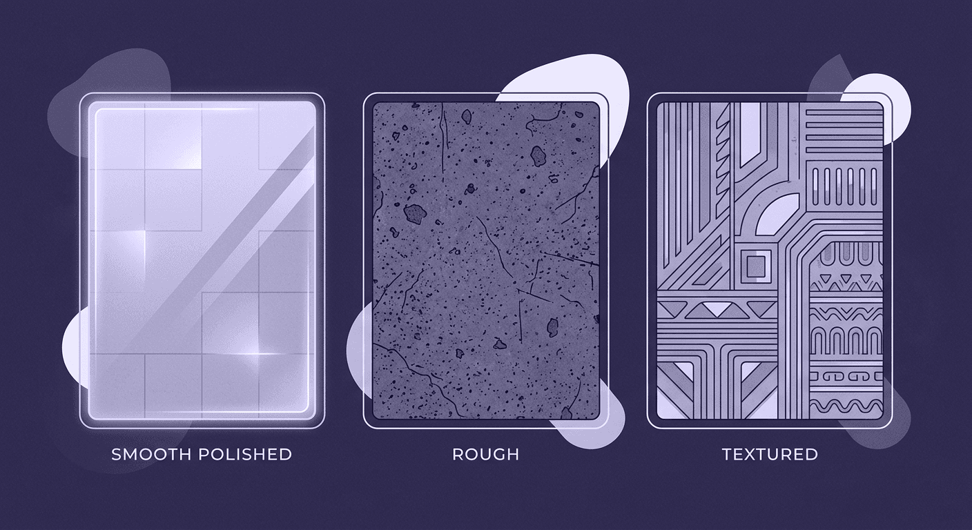
- Polished concrete: This is the sleek, sophisticated member of the family. It has a smooth surface with a subtle, satin-like sheen. The key here is in the reflections, they should be soft and diffused, not sharp like a mirror. Use this for high-end residential projects, retail spaces, or modern offices where you want a clean, minimalist feel.
- Pitted & raw concrete: This is where you get that classic raw concrete texture. It’s characterized by small air pockets (pits), aggregate exposure, and color variations. This texture is perfect for industrial interior design or for creating a single, dramatic accent wall. It adds a ton of character and feels honest and unpretentious.
- Board-formed concrete: This is my personal favorite for adding an architectural touch. It’s created by pouring concrete into wooden molds, and the wood grain pattern gets imprinted on the surface. It’s a beautiful way to add an organic, linear pattern to a scene. The subtle lines draw the eye and create a sense of rhythm. It’s a testament to the construction process itself, blending the industrial with the natural.
When sourcing textures, don't skimp. Look for PBR-calibrated maps with resolutions of 8K or higher. You need clean albedo maps, detailed normal maps, and most importantly, accurate height or displacement maps. A good texture library is an investment, not an expense.
Surface preparation in the digital world: Key mapping techniques
Once you have a great texture, you need to apply it correctly. But getting this part right is non-negotiable for realism.
First, let’s talk about creating depth. You have two primary tools: bump maps and displacement maps.
- Bump/Normal maps: These are great for faking fine details on a surface. They manipulate the way light hits the surface normals to create the illusion of bumps and dents without changing the geometry. They’re computationally cheap and perfect for subtle surface imperfections like small pits or a light grain.
- Displacement maps: This is the heavy hitter. Displacement actually pushes and pulls the mesh geometry at render time based on a height map. This is essential for achieving true realism, especially with board-formed or heavily pitted concrete. You’ll get real shadows in the crevices and accurate silhouettes. It's more render-intensive, but the payoff is immense. For a hero shot of a textured wall, displacement is the only way to go.
For UV mapping, the goal is to make it invisible. On a simple, flat wall, a box map will usually do the trick. But for more complex geometry, like a wall with openings or a curved surface, you need to put in the work. The key is to hide your UV seams in places the camera won’t see them, like along sharp edges or behind furniture. Take the extra five minutes to unwrap it cleanly. Your future self will thank you when the client asks for a camera angle you didn’t anticipate.
Styling in practice: How to decorate with concrete walls in your renders
A beautifully rendered concrete wall is only half the battle. To create a truly compelling space, you need to know how to style it. This is where you move from a technician to an artist, using textured wall design to build a cohesive and inviting scene.
Harmonizing elements in industrial interior design
Concrete is the undisputed star of industrial interior design, but it needs a supporting cast. The key is to create contrast in both texture and temperature. Concrete is hard, cool, and matte, so you want to pair it with materials that are the opposite.
- Wood: This is the classic pairing. The organic warmth and grain of wood, whether it's a polished oak floor or a rustic pine beam, provides the perfect counterbalance to the coolness of concrete.
- Metal: Lean into the industrial aesthetic with metals, but choose them wisely. Blackened steel and brushed brass add a touch of sophistication that keeps the design from feeling too much like a warehouse. Avoid overly shiny chrome, which can feel dated.
- Leather: A worn leather sofa or armchair introduces a soft, tactile element that invites you in. The patina of aged leather tells a story and adds a layer of lived-in comfort.
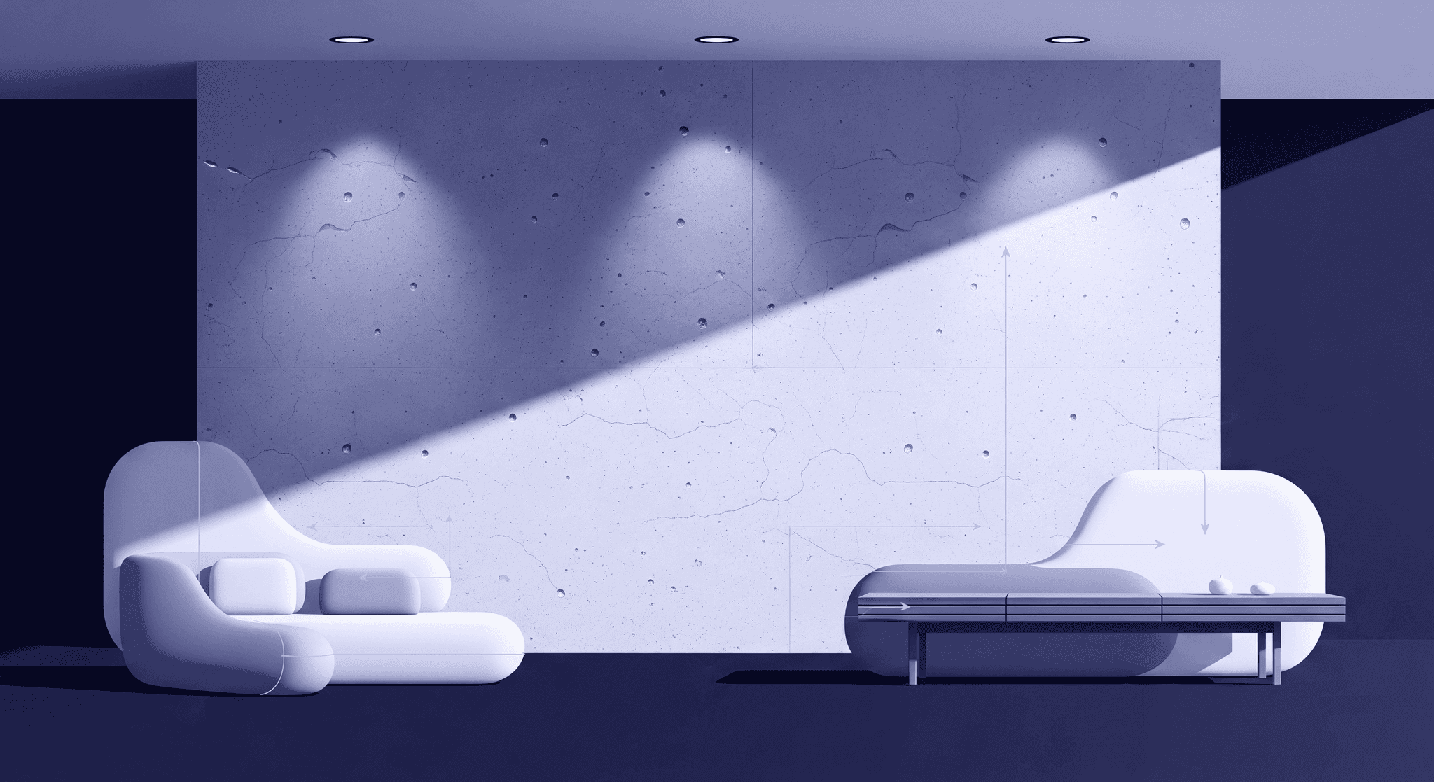
Lighting is your secret weapon here. Use techniques like wall-grazing, where you place lights close to the wall to cast dramatic shadows across the raw concrete texture. This technique highlights the imperfections and turns the wall into a dynamic art piece.
Achieving warmth in minimalist home decor
One of the biggest misconceptions is that concrete walls are inherently cold and uninviting. This is only true if you leave them isolated. In a minimalist home decor setting, the goal is to use concrete as a serene foundation and then layer in warmth.
- Textiles are non-negotiable. Think chunky knit throws, plush area rugs, and soft linen curtains. These elements absorb sound, add softness, and break up the hard surfaces.
- Use warm, soft lighting. Aim for a color temperature around 2700K. Ambient light from floor lamps and table lamps creates pools of warmth that make a space feel intimate and cozy, a stark contrast to the utilitarian nature of concrete.
- Incorporate greenery. Plants add life, color, and organic shapes that prevent a minimalist space from feeling sterile.
So, what furniture works best with concrete wall interiors? Look for pieces with clean lines but soft materials. A plush, deep-seated sofa in a light fabric, mid-century modern wooden furniture, or sculptural pieces with curved silhouettes all work beautifully. They provide a gentle contrast to the hard, linear nature of a concrete wall, creating a balanced and harmonious space.
Creating visual depth and emotion with texture
This is where we go beyond just making things look real and start using texture to tell a story and evoke emotion. A seamless concrete wall texture isn’t just a material; it’s a tool for manipulating light, space, and mood. This is how you start creating visual depth with concrete wall textures.
How seamless concrete wall textures manipulate light and shadow
Think of a flat, painted wall. When light hits it, it bounces off fairly evenly. The surface is predictable. Now, imagine light hitting a board-formed concrete wall. Suddenly, you have hundreds of tiny ledges and valleys. Each one catches the light and casts a micro-shadow. This interplay of light and shadow does a few powerful things:
- It creates visual depth. The surface is no longer flat; it has a tangible presence. It makes the wall feel solid and substantial.
- It directs the eye. The subtle lines in a board-formed texture or the random pattern of pits can create a visual rhythm that guides the viewer through the space.
- It makes light feel alive. As the sun moves across the sky in a time-lapse or animation, the shadows on a textured wall will shift and change. This dynamism makes your render feel less like a static image and more like a captured moment in time. The way a textured wall design simulates this natural light interaction is a key component of next-level realism.
The psychology of space: How texture influences mood
Texture has a profound, often subconscious, effect on how we feel in a space. As an artist, you can leverage this to control the emotional tone of your renders. This is a critical aspect of thoughtful interior wall aesthetics.
- Rough, raw textures create a feeling of stability, permanence, and connection to the earth. A heavily pitted or exposed aggregate wall can make a space feel grounded, safe, and timeless. It’s perfect for creating a cozy, protective atmosphere like a modern-day cave.
- Polished, smooth finishes, on the other hand, evoke sophistication, cleanliness, and modernity. A polished concrete floor or wall feels sleek and refined. It reflects more light, making a space feel brighter, more open, and more luxurious. This is ideal for high-end projects where the desired feeling is one of elegance and precision.
By consciously choosing your concrete texture based on the mood you want to create, you add another layer of intentionality to your work. You’re no longer just visualizing a building; you’re crafting an experience.
From good to great: Your workflow for standout concrete interiors
Bringing it all together requires a methodical approach. The difference between a good render and a great one often comes down to the final 10% of polish. Here’s how to nail your modern interior design with concrete walls every time.
A checklist for key details to check before hitting render
Run through this list to catch the common mistakes that can shatter the illusion of realism:
- Scale check: Is your texture scaled correctly? This is the most common mistake. A wood grain pattern from a board-form texture shouldn’t be the size of a railway sleeper. Use a reference object to get the scale right.
- Reflection values: Pure white or pure black don't exist in the real world. Ensure your concrete’s reflection values are physically accurate. It should be mostly diffuse, with a subtle sheen only on polished surfaces.
- Displacement/Normal intensity: Don't crank it up to 11. Over-the-top displacement looks fake. The effect should be subtle, just enough to catch the light and create soft shadows.
- Seam check: Even with seamless textures, do one last check from all your final camera angles. A seam you didn’t notice from the front might be obvious from the side.
- Edge and corner wear: In the real world, sharp corners on concrete get chipped. Adding a bit of edge wear or a subtle chamfer to your model can dramatically increase realism.
Concrete wall design ideas for home visualization projects
Need a spark of inspiration? Here are a few ways to use concrete walls in your next project:
- The fireplace surround: A board-formed concrete chimney breast can be a stunning focal point in a living room, blending rustic and modern aesthetics.
- The entryway accent wall: Make a powerful first impression with a raw, textured concrete wall in the entryway, contrasted with a sleek, modern console table.
- The open-plan divider: Use a partial concrete wall to subtly define zones in an open-plan living space without closing it off completely.
- The minimalist bathroom: Pair polished concrete walls with a freestanding tub and minimalist brass fixtures for a spa-like, serene atmosphere.
Finally, a quick tip for post-production: use an ambient occlusion pass to subtly enhance the contact shadows where objects meet your concrete surfaces. Then, add a touch of sharpening to make the texture details pop. These small final touches are what separate professional-grade work from the rest.
It’s more than just a wall
So, what’s the big takeaway here? It’s that a seamless concrete texture isn’t just a set of maps you plug into a material slot. It’s a storytelling tool. Anyone can learn to apply a texture to a surface, but the real artistry is the kind that gets you noticed comes from using that texture to build a specific feeling.
Think of it this way: the technical skills get you in the door, but the artistic insights are what let you define the space. You’re no longer just covering a wall; you’re controlling the light, creating depth, and setting a mood before a single piece of furniture is even placed.
The next time you open a project, don’t just ask, “Which texture looks good?” Ask, “What story does this space need to tell?” Is it about raw, industrial honesty or sleek, minimalist calm? Your choice of concrete is the first word in that story.
You’ve got the toolkit and you’ve got the eye. Now go build worlds that feel real, not just because the pixels are right, but because the feeling is, too.

Max Calder
Max Calder is a creative technologist at Texturly. He specializes in material workflows, lighting, and rendering, but what drives him is enhancing creative workflows using technology. Whether he's writing about shader logic or exploring the art behind great textures, Max brings a thoughtful, hands-on perspective shaped by years in the industry. His favorite kind of learning? Collaborative, curious, and always rooted in real-world projects.
Latest Blogs

A Practical Guide for How to Choose The Right Concrete Texture fo...
3D textures
PBR textures

Mira Kapoor
Apr 29, 2026

VR Textures in Unreal Engine: A Beginner’s Guide to Setup, Optimi...
3D textures
AI in 3D design

Max Calder
Apr 27, 2026

360 Environment Textures vs Traditional Textures: Key Differences...
AI in 3D design
PBR mapping

Max Calder
Apr 24, 2026
